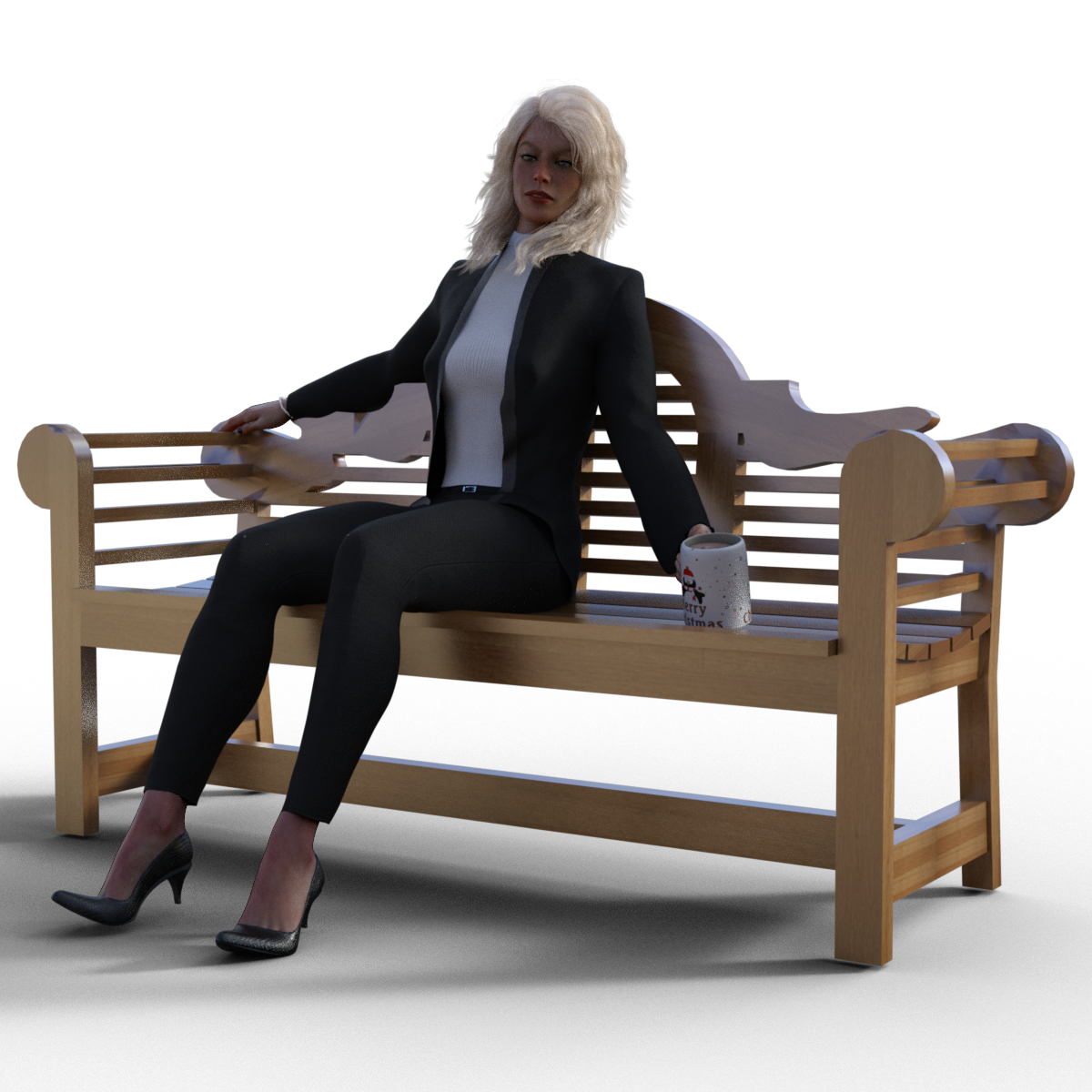
Lutyens Garden Bench
 richardandtracy
Posts: 5,919
There is a DAZ+ freebie at the moment of various Everyday Benches - https://www.daz3d.com/everyday-bench-prop-pack. Anyway, even though the set was quite nice, I was a little disappointed not to see a real classic. So, I modelled a Lutyens Garden Bench to the general dimensions of the one in the now out of copyright 'Fine Woodworking ' article in the July/August 2000 edition.
So, can I offer a quick freebie before returning to my Bridge Model. There is an Obj and 5 material settings for it.
Hope you like it.
Regards,
Richard.


Lutyens Bench Promo.png
1200 x 1200 - 1M
zip

zip

Lutyens Bench.zip
3M
Post edited by richardandtracy on


Comments
thank you.
very classy! nice work on the curvature of the seat.
:)
j
Oh, this is lovely, thank you so much!
Very nice Richard. Snagged it on Rendo as soon as I saw it.
Oh wonderful, thank you :-)
Thanks Catherine.
I would like to, but my modelling skills are not there, model up a bench we do have. When our house was built in 1896 it was called 'Lily of the Valley Villa', but as that was a mouthful it was changed before 1916. Anyway, to remember that, on our silver wedding anniversary we bought a reproduction Coalbrookdale 'Lily of the Valley' garden bench, in cast aluminium. It's incredibly comfortable and nice to look at. Ours is dark green.
Wish I could think of a way of modelling that.
In getting that image address to pop in the post above, I had to go to the foundry web page. Hoo boy. The price of new ones has more than doubled in the six years since we bought ours. We'd never have been able to get it now. Ouch.
Regards,
Richard.
Love it! Been actually starting to work on some more couple poses & this prop came in at the right time. Hope you don't mind me promoting it when I release the new poses?
That's superb. Love it, love it, love it.
If your poses are as good as your previous ones (and why wouldn't they be?) then I'm delighted for you to promote them here too - we all benefit.
Regards,
Richard
I might be persuaded to make an attempt at modeling something like this. I love a challenge. Do you have higher res pictures of yours?
Not at the moment. But I do posess a camera (albeit very old) and it should still be light when I get home.
I'll see what I can do.
Regards,
Richard.
Even phone camera pictures would be okay ;-) It's just hard to see the detail. Although, I could just go rogue and design something similar.
Well, let's just say my favourite phone has a separate earpiece from the speaking tube and has a wire. It's in our livingroom. I have zero, no, zilch mobile telephones and the same number of smart phones. I have a tablet, so I'm not entirely in the dark ages, oh, and a PC, too.
The photos are a bit below full 10MP resolution as they all came in at over 4Mb each. The algae & lichen show up in the flash much more than in real life, and it looks really grubby in the photo . Battery died on my camera after 4 photos, but I think it gives the flavour. The Lily of the Valley has a depth of 12mm on the back, so it's moderately high relief. It's symmetrical. I can give dimensions tomorrow if you want.
The Coalbrookdale foundry produced a number of different designs: Lily of the Valley, Blackberry & Fern (similar to the Lily of the Valley in overall shape), Nastertium, Passion Flower and Horse Chestnut. All are highly sought after in the original cast iron. I know a 4 seat Nastertium original can fetch in excess of £7k. Quite a bit more than the aluminium, however I might complain about the aluminium price.
Regards,
Richard
This is perfect. Thanks, Richard.
Poses 01 - 04 for this have been uploaded to renderocity, should be there whenever it goes through the approval.
Hope they go through your approval as well!
Oh my, they look most impressive.
Regards,
Richard.
These look great!
These flowers are fiddly, man.
I know, that's why I said 'I wish I could think of a way of modelling it'.
I suspect a loft starting at one stem, widening out and then narrowing off could be done for each leaf, but would need the same number of lines in each cross section sketch of the leaf and 3 or 4 cross sections. It's not easy at all. You've got a great deal further than I have tried to get.
Regards,
Richard
(Edited for tripe writing error)
Thank goodness for the "facet" primitive. I can't guarantee this will be a perfect copy by any stretch of the imagination, but it is super fun and I love a challenge.
Tip re modelling all those leaves, if using the cloning tools, use the tool utility to merge close dots [just in case any unwelded], then uvmap it, then clone it. Normally that's easier than trying to uvmap it afterwards.
Yeah, I know. I always forget though. I'm not even UV mapping this sucker, it will be one material. LOL.
But, progress...and yes, those are all booleans in the seat. Hexagon (and even Blender, actually) crashed each time I tried it as a whole, so I had to do it in tiny pieces. But I've got nothing better to do and it's keeping my mind off my mysterious illness and upcoming procedures on Monday.
Please, at least "slap on a uvmap" or many shaders won't apply well.
Booleans - from Hexagon!!! oh dear, NO. Toss that into D/S and see what it looks like ;-)
It doesn't look absolutely awful in DS, although I see some holes I need to fill in. This is with a metal shader, which also doesn't look terrible, but I'lll slap on a basic UV map to avoid breakages at the sides of the map.
On second thought, I'm going to have to redo it without booleans anyway because in DS it will barely move the camera there are so many polygons.
Usually with booleans from Hexagon, D/S will make "plates" all over the place making the work unusable as is. There is a trick which helps, so I've read, but so far it's been better just not using booleans in Hexagon. I have no idea if booleans are used in other programs what D/S does with those.
Detailed patterns usually work better by making use of the opacity/cut out textures - and a "normal" pattern &/or a good displacement map. I keep trying different ways of modeling patterns but normally run out of patience and/or Hexagon runs out of memory.
@richardandtracy - Good call, I should have not run from Iray from the getgo. But even without a texture applied I still couldn't move the camera in DS. Reducing the bench polygon count by ditching booleans made a difference. I can move the camera in Iray at least.
@Catherine3678ab - Yeah, that's what I'm going to have to do. I'm proud that I could do it in Hexagon. It's definitely an insane amount of polygons which is a huge drain and I'll definitely be doing it with an opacity map. I feel like although I've been using Photoshop for more than 20 years, I still struggle texturing so it looks realistic. I probably should take a class, but I never have enough time since I work full time and have grade school aged kids.
I wish there was polygon reducers somewhere. Although I don't know if that would be possible with this design at all.
In Hexagon and with decimator in D/S one can reduce the polygon count BUT yes, you would lose that beautiful detailing.