January 2023 - Daz 3D New User Challenge - Composition, Instancing, & Duplication
 DAZ_ann0314
Posts: 2,860
New User's Challenge - January 2023
Sponsored by DAZ 3D
Are you new to the 3D World? Are you at the beginning stages of learning 3D rendering? Have you been around for a little bit but feel you could benefit from some feedback or instruction? Have you been around awhile and would like to help other members start their creative journey? Well then come and join the fun as we host our newest render challenge!
Back by popular demand (or well because we think it went well LOL), we are breaking down each month into 2 different challenges:
A Beginner Challenge and then also an Intermediate Challenge.
So which "Challenge" should you choose?
Follow the Beginner Challenge if you are:
- New to the New User Challenges
- New to Daz Studio
- Newer to 3D Rendering in General
- Or if you have not participated in the January Composition Challenge
Follow the Intermediate Challenge if you have:
- Participated in the New User Challenge for awhile
- Know the basics of Daz Studio and would like to learn more in depth topics
- Been using 3D Rendering Applications for awhile and feel comfortable with learning Intermediate Topics
- Or if you have all ready been spotlighted in the January Composition Challenge
*Please be sure to list in your post which Challenge you are participating in


Comments
Beginner Challenge:
"Composition"
This is a general render challenge with the focus on how you compose your image. We are providing you with lots of great links on Composition from a variety of sources. Composition is key to pulling a viewer into your image and leading their eye to where you want them to see things. It is a fundamental skill that we, as artists, not only need to learn, but will continue to hone over the years. Read about and look at the examples, in these articles, for how composition works and how artists, from the Masters to people like you and me, put these compositional guidelines to use to make our pieces more appealing and invite the viewer to look around your image as you intended.
For those completely New to Daz Studio, we HIGHLY RECOMMEND checking out the new MASTERCLASS!
General Composition Rules:
http://design.tutsplus.com/articles/5-fundamental-skills-every-artist-should-master--psd-28054
The Golden Ratio:
https://designschool.canva.com/blog/what-is-the-golden-ratio/
http://www.hongkiat.com/blog/golden-ratio-in-moden-designs/
https://www.youtube.com/watch?v=8A3JnWzgXGk
Some Tools for DS and Bryce:
Golden Rules Camera Prop v1.5 by Jaderail
Golden Rules Composition Helpers for Bryce by David Brinnen and Horo
Artists, filmmakers and photographers share similar traits in how we present our work, so you will find that a study of the art of photography will help, which is why you see various links to photographic articles included.
Photography Composition:
http://digital-photography-school.com/5-elements-of-composition-in-photography/
http://digital-photography-school.com/5-more-elements-of-composition-in-photography/
Color can be used as a compositional element, especially when you have color contrast. Here are some fundamentals on color:
Color Fundamentals:
https://99designs.com/blog/tips/the-7-step-guide-to-understanding-color-theory/
Other Types of Contrast:
http://photoinf.com/General/NAVY/Contrast_and_Framing.htm
Examples of Composition:
http://www.pinterest.com/dawnshiree/rules-of-composition/
Examples from Netflix's The Queens Gambit (The Director of this series did an EXCEPTIONAL job applying the Rules of Composition):
Composition of The Queen's Gambit (You may need a Facebook Account for this link which directs to a post - be sure to scroll through the pictures as there are TONS of excellent examples)
This is a bit of a long read but offers excellent examples of different kinds of composition and camera angles.
The Cinematography of "The Incredibles"
Prior Composition Challenges:
January 2022
January, 2021
January, 2020
January, 2019
January, 2018
January, 2017
January, 2016
January, 2015
I will be checking in as will the rest of the Community Volunteers to try and help with anything you all may need.
For a list of the current challenge rules, please see this thread : Challenge Rules
Closing Date: January 31st 2023
Intermediate Challenge:
"Instancing and Creating Duplicates"
This is a general render challenge with the focus on using Instancing and Duplication within a scene. We are providing you with some links on the topics from a variety of sources. Utilizinging Instancing and Duplication well is key to creating intricate scenes while saving on file sizes and processing power. It is a fundamental skill for those wishing to do large battle scenes, those wishing to create their own worlds, or those wishing to create an environment that seems full and complex.
*If participating in this Challenge, please be sure to list what item(s) within your scene you have instanced or duplicated*
General Instancing and Duplicate Creation Information:
Node Instances
1. Click on the item in the scene you wish to Instance
2. Go to Create - New Node Instance (Good for Singular Instances)
or
1. Click on the item in the scene you wish to Instance
2. Go to Create - New Node Instances (Good for adding Multiple Instances at once)
Pluses:
Doesn't use as many computer resources as loading in the items again (So it won't show as more Geometry Loaded in if you look at the Scene Info Tab)
Great for filling in a scene with items that are going to look identical while keeping the computer strain down.
Can Populate a scene fairly quickly
Minuses:
All the items will share the textures of the original item.
Node Instances are an exact copy of the original, they cannot be morphed or posed separately
Duplicate Nodes
1. Click on the Item in the Scene you with to Duplicate
2. Go to Edit - Duplicate - Duplicate Node(s)
Pluses:
Creates a copy of the Selected Item
You are able to change textures, manipulate, repose etc as if you added in a new copy
Minuses:
Doesn't Save on Computer Resources since it is basically the same as loading in a second exact copy (Rig, Bones, and All)
*Duplicate Node Hierarchies *
(Duplicates the entire node tree below the Selected Node)
Example: If you select Genesis 8 that has clothing and hair attached then it will Duplicate Genesis 8 as well as the attached hair and clothing.
1. Click on the Item in the Scene you wish to Duplicate
2. Go to Edit - Duplicate - Duplicate Node Hierarchies
Pluses:
Creates a copy of the Selected Item and all items attached to it. (Great for creating a copy of a Figure with included clothing, accessories etc)
You are able to change textures, manipulate, repose etc as if you added in a new copy
Minuses:
Doesn't Save on Computer Resources since it is basically the same as loading in a second exact copy (Rig, Bones, and All)
Generally you want to use Duplicates or regular full figures with varying poses etc in the forground of the scene and then use the instances more in the background or as scene filler where it will be less likely to notice they are the same (especially useful when using Depth of Field etc) It can also be used to help cut down computer load when you actually want or need to identical things (props etc) in the scene..such as two chairs in a livingroom, two tanks (or 20 tanks) on a battlefield, multiple candles in a scene that are all the same color, books placed on shelves, potion bottles that can be moved to various places across the scene, or things like trees and grass.
Examples of Using Instances and/or Duplication within Daz Studio:

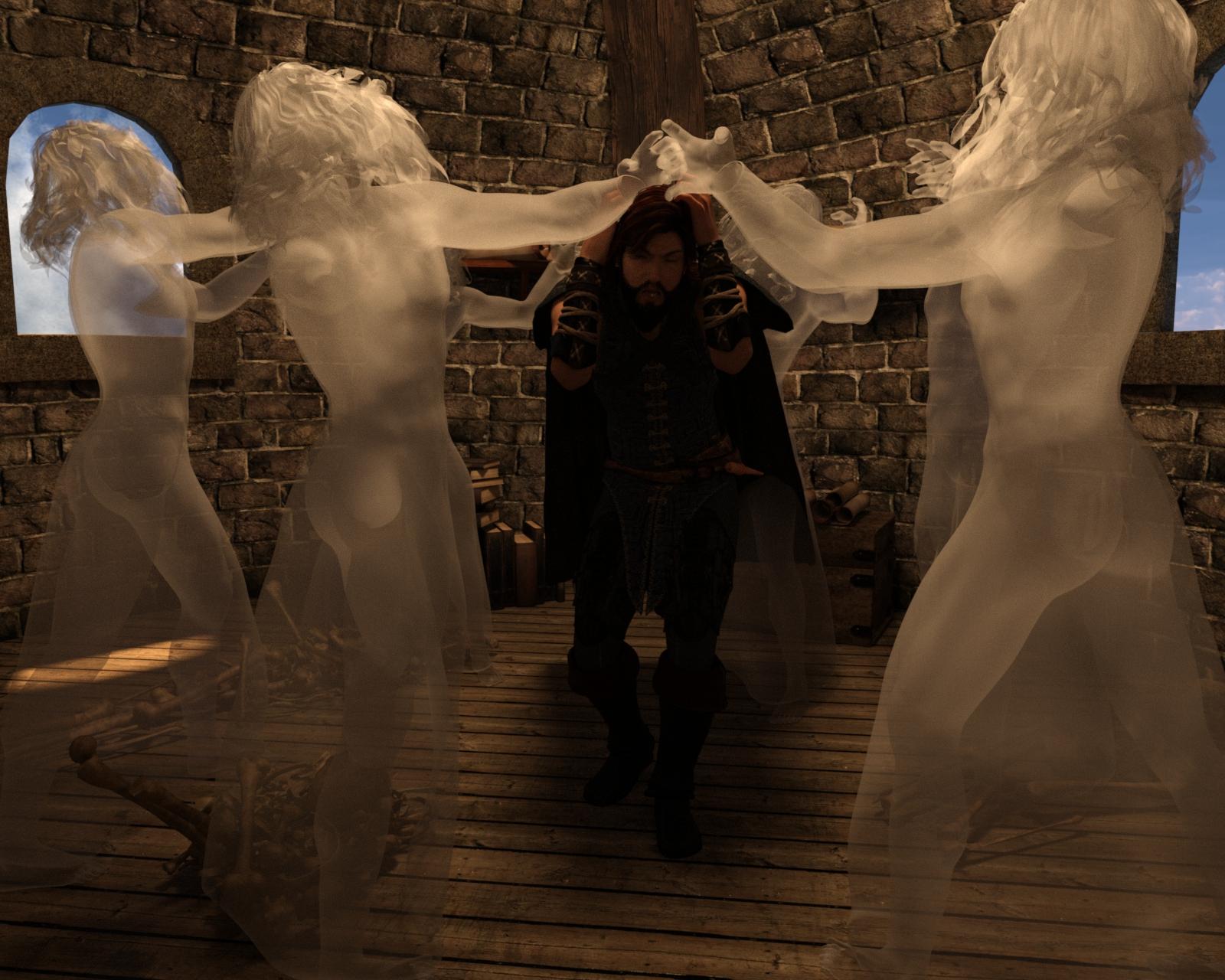
Instances used for the Spectres that are Attacking Ater Eterwood
(Special Thanks to Totte - Code 66 for the Example)
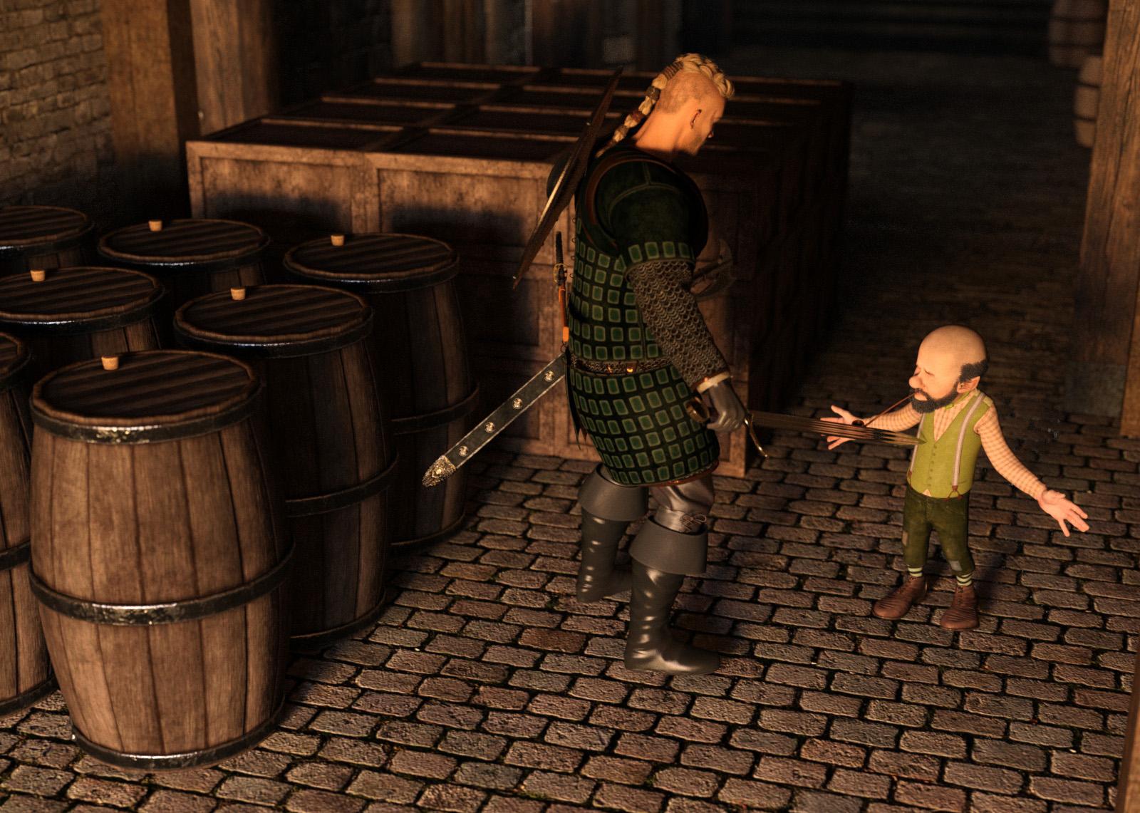
Instances used for the Crates and Barrels. Barrels were rotated to avoid the repeated look.

(Special Thanks to Totte - Code 66 for the Example)
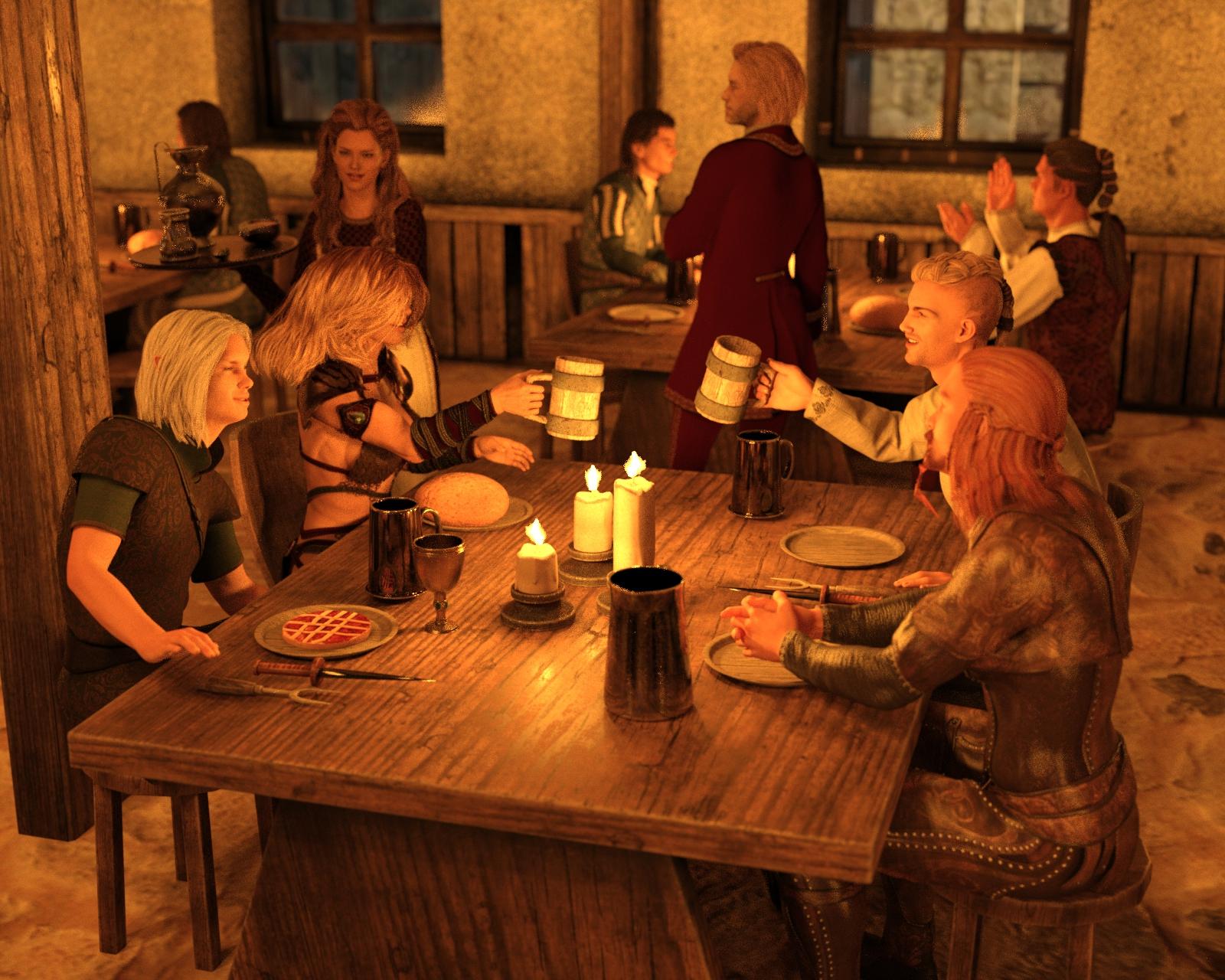
Instances used to add more Patrons to the tavern

(Special Thanks to Totte - Code 66 for the Example)
Handy Products to Use while Instancing:
FlockIt
Traffic Patterns Script and Prop Collection
Have a Seat
Stack'Em Up
UltraScatter Advanced Instancing for Daz Studio
UltraScatter Pro
Instances Plus+ for Daz Studio
Prior Composition Challenges:
January 2022
January, 2021
January, 2020
January, 2019
January, 2018
January, 2017
January, 2016
January, 2015
I will be checking in as will the rest of the Community Volunteers to try and help with anything you all may need.
For a list of the current challenge rules, please see this thread : Challenge Rules
Closing Date: January 31st 2023
Chasing Butterflies
I have used instancing for the flowers in this image. Constructive criticism welcome
intermediate challenge
title: marching band
software: DazStudio
Instancing: the marching band and the people on the street.
Title: Sands of War
Is the battle for sand? Or does the battle grow from within? Will the dry lands become a place of newborn legend, or will a soldier fall and return to the forgotten sands of history.
Intermediate Entry
Instancing used on the army, horseman, archers. No post work. All completed in Daz Studios. I hope I can submit one more before the end of the month too!
I think that Instancing is almost like billboards they do not take up much of your resorces to render them!
Lots of fun entries so far and lots of instances that I can see! Glad you all are enjoying the topic. They can definitely be a lot of fun to fill in a scene. So far everyone is using them wonderfully
Title: The Assasin
Level: Beginner
Major Items:
https://www.daz3d.com/michael-9-hd
https://www.daz3d.com/dforce-kuj-fashion-coat-suit-for-genesis-9
https://www.daz3d.com/go-action-poses-and-props-for-genesis-9 (weapon not pose)
Supporting Items:
https://www.daz3d.com/dforce-ultimate-buzzcut-hair-for-genesis-9
https://www.daz3d.com/collective3d-create-a-room-xpack-3
Title: Nistia
Level: Intermediate
Queen of the Dead leads her undead hordes out of the mist. Instanced items are the zombies in various poses. I believe I got ten of them in there. All critiques/criticisms welcome.
Level: Intermediate
Title: Steampunk Station.
Software: DS, postwork in Affinity Photo
Duplicated items: Rails, tunnel and ground, milk churns, and (just visible by the tunnel!) budliea bushes
(Actually there are more duplicated items in the full scene (like the station lampposts) but I decided to go in closer to the scene than I originally intended!)
lovely scene @stargazey I was just wondering about one thing, the ground textures, like the pebbles in the rails bed and the floor on the platform look strangely flat, could it be that they are lacking bump/displacement or normal map?
@jecswp that's a good scene, I liek the way you instances the skeletons without looking too uniform and as well the light and the fog you used, seems only the size relation might have gone awry while posting in the post, because in the attachment it looks good
@apprentice, nicely done work with the light, composition and usage of empty space, personally I think reducing the depth of field a little bit so that we see a bit more of the environment might make this even better
There are bumb maps there (set at 100%) but it is quite an old product, AFAIK originally made for Poser. Maybe there are other settings that would improve this, but I don't really know what to adjust (increasing the "bump" doesn't seem to make much difference).
The original is a bit on the grainy side, I'm not sure if changing the render settings would make any difference, or maybe different lighting!
Really like the lighting and POV on this one, nicely done!
Really well done! Nice job changing them up by varying the post and I really like the way they are in the haze. Adds a certain foreboding.
Also very well done! You created a really nice scene/environment for your subjects with lots of details for the eyes to go to!

So far everyone is really doing incredible! It will be really difficult to pick the spotlights this month, I can tell all ready
Really nice job on the variation on this one as well! It looks like a rather large army they will be facing which really helps build the suspense of the composition. Nice work!
This makes me think of the movie "The Music Man" Again there is a really nice job with the variation of the band members with the different instruments etc. If you wanted to add a bit more variation you could look at varying the poses of a couple here or there within a specific "section" of the band but there is a lot of really great detail here and its really well done!
Title: The Assassin - Update 1
Level: Beginner
Thx for your feedback @Linwelly. You are definetly right. I made 3 more different renders with different f-stops. Please, your honest oppinion - still too much?
In addition I saw, that I forgot to retexture one of the walls, which is now fixed.
@DAZ_ann0314 Thank you.
Major Items:
https://www.daz3d.com/michael-9-hd
https://www.daz3d.com/dforce-kuj-fashion-coat-suit-for-genesis-9
https://www.daz3d.com/go-action-poses-and-props-for-genesis-9 (weapon not pose)
Supporting Items:
https://www.daz3d.com/dforce-ultimate-buzzcut-hair-for-genesis-9
https://www.daz3d.com/collective3d-create-a-room-xpack-3
@apprentice, this looks really cool now, hard to say if it would be better with a different f/stop setting but in my personal view I like this level of DOF, gives the viewer enough information about wht's in the back but still pops the character
to give usefull advice here I would need to see the bump map, you could try to change the maximum settings in the bump map preferences settings, but that might lead to some unusual results as well. Since you're using Iray, feeding the bump map into displacement will not make a big difference aside from increasing render times. Things you can most likely change is the glossy settings, reduce reflectivity and increase roughness, maybe even feed the bumpmap into that channel. You could try to make an ad hoc normal map out of the bump, there are several online tranformer apps where you just feed one images and get an instant normal from that, it's of course not accurate in the detail but might give some good results here.
@DAZ_ann0314 Thanks! The army was originally much bigger (around 3,200), but my system struggled too much. Had to cut the numbers in half, unfortunately.
Thanks for the advice, Linwelly, I will have a "play around" to try to improve the image. Unfortunatly I doubt if I'll manage to get it done in time for the competion, as I'm a bit tied up with other projects, but I'm sure it will be useful if I can get the hang of editing things like bump and normal maps, rather than just using the default settings.
no worries @Stargazy it's all at your own speed and decision, I'm just trying to hand out the tools and options that stand at your disposition
I have added some extra flowers and changed the lighting slightly. Comments are welcome but I am unsure as to whether I will have much time to change the image.
intermediate challenge
title: marching band
software: DazStudio
Instancing: the marching band and the people on the street.
I've added another 16 chars and changed a few musicians to get more differences.
Title: I Have a Bad Feeling About This
Level: Intermediate
Here is my second enttry. Instanced items are the goblins lurking in the shadows. Again, any advice or criticism welcome, especially regarding my use of volumetric lighting and the color of the moonlight.
hey @jecswp nice work here I like the green eyes lurking in the dark
some thoughts, all of the eyepairs have the same angle wich looks a bit too uniform, so you might want to turn the instances a bit around
And I think the voluminethric is a bit too thick, you want it obscureing the creatures but we might want to guess an outline here and there.
for the light on your fighter it looks like your major light source is from the top which gives him a very strong shadow so a suggestion would be to add some more lights (classic three point lighting coming from the sides and reduce the intensity ot the top light a bit
Thank you for thesuggestions, @Linwelly. Completely busted on the eyes. I widened the spread and drew a couple of the goblins closer to the edge of the light. And I adjusted the position of the spot light which makes the shadow longer and softer.