Input on a possible Cover Design
 Brotherlobo
Posts: 495
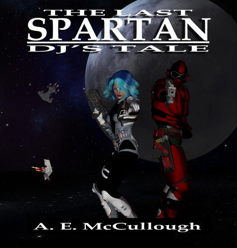
Greetings all. I would like to get some input/feedback on my latest idea for a cover design.
This is primarily planned for an eBook novella (shorter than a novel but longer than a short story) featuring one of the sidekick characters from my Sci Fi novel 'The Last Spartan: Different Paths.' I'm putting the finishing touches on this story before it goes to editors and test readers next week.
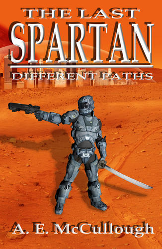
Since I am a self-published author with limited funds, I've had to create my own cover designs. The first cover below, was the one I created in Photoshop using purchased items from Dreamstime. It is for my novel which came out in March (how I wish I had found DAZ back then). The cover isnt perfect but then, I wasn't using DAZ and had to cobble it together. I might re-work this cover soon but atm it is still selling well. And as the old saying goes, if it isn't broke, don't touch it.
The second one, 'The Last Spartan: DJ's Tale' is the new cover. Looking for input and suggestions for it.
Thanks.


Comments
Hello A.E
I like the first cover.
In The second cover, the characters don't stand out. They are too dark and blend in so much they really don't catch my eye.
If you want, PM me. I can make a nice cover for you and won't charge you (especially if I have what I need already on my computer).
Yep. Free.
All I ask is you give me credit for the work.
I think that it would be more compelling if the characters popped more. A bit brighter lighting and a bit more specularity on their armor. You could also pull the moon and the fighters in a bit closer to brighten the overall cover.
Since it looks like this is a part of a series I'd also suggest you use the same font and text layout. Perhaps without the shadows since the cover is not as bright color wise.
That is my totally uninformed take on it.
The first one is good, but try a render of a closeup of the helmet on the ground in the sand. That would be cool too.
The second one is too dark. If you can find a bright and colorful galaxy scene, that would make it pop more. Maybe make the letters a different color (red or yellow instead of white). SOme books have trims around it, try adding a subtle border around it. Look at the examples below. Notice how they are bright and colorful and the letters are bold.
Would you like to have a contest to see who can create a cover for you? I'm sure all who submit a cover would allow you to use it free of charge or credit. Just an idea. If you are the type who likes to make their own stuff, thats fine too. Are these your cover for your novel you are writing? I'm actually writing a kids picture ebook for iBooks iPad and will be self publishing myself. Have you published an ebook yet and how easy or hard is it?
I am by no means an expert, yet as a reader I can say that the first cover would attract me more. I like it very much, especially the orange colour is very catchy and the cover looks like made by a professinal to me. It may be a bit minimalistic (not many figures, no action etc.) but that seems to be exactly what works here and makes this cover so interesting. The second picture looks to me more like a movie poster (they are generally dark), not like a book cover. As already stated in posts above, it is too dark and the figures are not very good visible. Background can stay dark (I have seen many dark covers that looked fine), but a bit brighter colors on the figures would be better. Also, if that is a series of books, it would be better if the covers resembled each other more - not just the font, but also similar cover art.
I agree with Proxima Shining, except that I think the first one is just fine. If you look at the examples I gave above in my post, the pros have very simple cover designs. i was suggesting maybe the first cover to be even simpler by adding just the helmet resting in the sand and maybe the sword caked in blood laying in front of it. Covers work best when they create a question in the mind to the potential reader.
I would be afraid, if he used just the helmet and sword, people might confuse it with a tale about ancient Sparta at the first sight. (In e-shop they would see small thumbnails with not much detail and might not notice that is a modern-looking helmet.) With the whole figure, dressed like this, it is more obvious that it is a sci-fi book. That - and also, as a book reader/buyer I like it when there is some person on the cover, not just some vehicle or vegetation etc. (my personal quirk, I guess).
If you want some feedback on this issue try PMing a member called Daniel A Roberts
In the old fourm he ran 3 contests, one for each of the three parts of his trilogy, which is also self published. They were great fun, and he got some super renders turn up.
WOW...thanks for all the input. Let me see if I can clarify my situation.
1) Yes, I intend this to be part of a series following Iaido 'Achilles' Spartan (ex-spec ops veteran turned bounty hunter) and/or his friends on thier adventures. This first book is out (the first cover) and available at Amazon. This novella is covering one of the side characters, allowing me to flesh him and the world of 2212 out a bit.
2) Yes, I like the first cover more. However, if I had DAZ back then, Iaido would've been in the Coalition Rapier Armor (see attached) but the background would've been the same.
3) I agree, that the 2nd one is too dark. I'm not in love with it but after a week tweaking it while learning the program, I thought I would get some feedback. And boy, did I ever.
BTW -- I'm really loving this community. All I have found has been positive feedback, helpful suggestions and answers to my newbie questions.
tsarist - I might just take you up on that offer. Be looking for my message. However, Jake_Russel suggested a contest and that sounds good too. But I never turn down free advice or help. After all, my passion is writing...playing with graphic designs is just a hobby.
khory - Don't underestimate your opinion as a reader, I don't. I agree with you on the cover, hence this thread.
Jake_Russel - Thanks for the examples and suggestions. I like the helmet in the sand - bloody sword idea. Might want to use that on the sequel. This one 'DJ's Tale' is just a small novella not the full fledge sequel I am also working on.
Proxima Shining - Good points. I agree that it would be best if the covers in the series resemble each other a bit. The first book, took place (or centered around) Mars - hence the red sandy background. This novella takes place on Titan (Jupiter's moon) it is icy although that could work too.
Side note/question: I also was leaning toward the subtitle - DJ's Rescue instead of DJ's Tale. Any opinions on the two? I want to make sure the readers know that this novella is about DJ (one of the side characters) and not focusing on Iaido.
DJ´s Rescue - sounds like DJ is the one to be rescued. With such a title I would expect that the book is focused about someone who is rescuing DJ (= this rescuer would be hero of this tale). So I´d say the second title (DJ´s Tale) works better if DJ is the hero. Or what about DJ´s Mission?
Also, whoever of the two people in your cover above is DJ, I am not sure, but maybe s/he should be in front of the other person, to make it clear right on the cover who is this book about?
Going back to this idea, one of my submissions for Daniel's contest, I used this style, and it ended up getting the 2nd place. Gave me a chance to bring in all the 3 major characters,
Good point Proxima -- I hadn't thought of 'DJ's Mission' as a subtitle but it works. I think I like it even better than 'DJ's Tale' -- it implies that this focuses on a mission and not his whole story. Thanks :-)
Sometimes in writing (as in life) the writers gets too focused on one aspect (ie the title) and knows something is wrong but can't see the solution.
What about these titles:
DJ's Fate
DJ's Obstacles of Fate
DJ's Destiny
The Future of DJ's Destiny
DJ's Fears
More good suggestions. :-)
I am really considering the contest idea. I might even add that as a component of the contest. Checking with one of the forum adminstrators now about the idea. BTW -- I just scrolled thru your 'fake magazine covers' -- there are some good ones!
Lots of good advice coming here... the only thing I'd add to it is to make the aspect ratio of both (eventually all) of your covers the same.
It just helps to identify them as a set, that's all. :-)
Thanks. What's your series about? Give us a quick summery.
Thanks for all the wonderful suggestions. I have decieded to have a contest and started a new thread.
I hope everyone who particpated in this thread will chime in on the contest.
But to answer your question: Sci-Fi – the story mostly takes place on Titan (one of Jupiter’s moons) in the year 2212. Think icy surface & bio-domes for habitats. Ex-Marine Staff Sgt. Scott ‘DJ’ DeJarnette – is contacted by his 12 year old daughter via UR-L8 her ‘babysitting bot’ (think yellow and black boxy robot w/ treads) that she and his ex-wife are being abused by her step-father.
The problem is two-fold 1) according to the Coalition, DJ has no parental rights. They were stripped from him when he was thrown in New Leavenworth 2) His ex-wife’s husband is very rich and powerful. He pretty much runs the Saturn System as his own personal fiefdom and DJ knows that he will be arrested the moment he steps foot on Titan. With the help of his friend, Iaido ‘Achilles’ Spartan, he goes undercover as the bounty hunter ‘Red Falcon’ an old cover identity of Spartan. Unfortunately since he hadn’t used it in many years, someone else has been passing themselves off as the Red Falcon but supposedly, the doppelganger is in Confederate space atm.
Arriving on Titan, DJ gains the help of El Gato, a rogue CIA agent (female – originally blonde but can change her hair color with a simple thought) and Jagger Jax, a former pirate and thief – now reformed and looking for a new career away from the notoriety of his past. For DJ to rescue (ie kidnap since this isn’t a legal bounty) his daughter, he must avoid the Saturn Sheriffs, make (and keep) a deal with the Cartel (the Mob in space) and escape Titan City before the upstart Falcon arrives.
I made a possible Red Falcon Symbol or Crest. This would be on his armor. But you have other "teams". What are their names. Also, can you list the main characters of your story and what armor they wear and what color (since I assume red falcon armor is red)?
Jake....sounds like you know something about these programs.
Let me see...in the current novella - DJ is the main protagonist. He is an ex-Marine, the ground forces of the Fleet, going undercover as a bounty hunter. In my future, UNCF -- United Nations Coalition Forces -- is the prominent power on Earth. I have the Coalition military divided into Fleet (ie Navy and Airforce) and Strike (Army and any other ground forces they absorbed).
The other main two sidekicks are: Stephanie ie 'El Gato' a CIA -- Coalition Intelligence Agency - agent that has gone rogue (kinda - she still works and reports to her handler, he just no longer reports to the Agency). She wears something closer to the outfit of 'The Black Widow' from the recent Avengers movie. She is also a master at Parkour and several other martial arts.
Then there is Jagger Jax - notorious thief and pirate. He was cleared by Presidential pardon in the first book when it became known that a doppelganger had been masquerading as him for almost a year. Unfortunately for Jax, everyone in the Underworld thinks he's a squealer, so they won't deal with him (on pain of death) and the general public recognizes him everywhere he goes.
Iaido 'Achilles' Spartan - only makes several appearances in this novella. He would be the one wearing the black and silver Coalition Rapier (or Katana) Armor w/ the skull (think Punisher) on the opaque faceplate of his helmet. He would also have prominentlyly displayed on his armor an Omega symbol in homage to his lost squadmates -- Omega Squadron. After all, he is the Last Spartan (for more on this see my 1st book).
On the antagonists side - we have the SS - Saturn Sheriffs - the police force of the Saturn System and the SIS - Saturn Intelligence Service - the covert and enforcement arm of the SS. Yes, they use the stylied twin lightning bolts as thier symbol.
I hope this helps.
O yes, this is perfect. Your books are sounding more and more interesting. I think I may need to buy one and read it. But one more thing. I assume you have a description of their appearance (like do they have a beard, scar, muscular or skinny, curtain hair style or color) because from my experience with writing, I know you have already described their appearance in book 1. So making a cover with characters that don't match your already fleshed out characters will not work for a cover for the next book unless you say they changed appearance.
So what does DJ "look" like: Since he is an ex-marine, he probably looks muscular and hard edged, right?
Stephanie is blond but can change hair color. So I assume you want her to look basically like The black widow (long-ish hair style and black skintight suit)? If so, that's all I need to know.
Jagger Jax (Cool name by the way) is a thief and a "squealer" so he must be more slim and quick on his feet. Maybe a little shorter than DJ?
Iaido is like a background character so he's more mysterious. I assume he has no identity since he wears the suit all the time? Just guessing. Since he only appears once in a while, he would be known as the "black suit guy" and not have much description about his appearance to far beyond that.
Saturn Sheriffs are self explanatory (futuristic cop outfits)
SIS have similar appearance to the SS suits but with the lightning bolt as their emblem.
Reason why I ask this is because I am trying to make a group cover image that summarizes the characters in the story. Just need a little more info on how the main people look so to stay true to your story.
Sounds good.
Let me see if I can clarify your questions - DJ was introduced in the 1st novel this way:
And what the SWAT officers saw when Iaido stepped out in his armor:
So DJ is:
-Broad-shouldered (I take it as a husky look)
-Retired so he is an older man (Mid 50's)
-Has a slight belly
-In some kind of uniform
So Laido is:
-Bald
-Muscular in an athletic way
-Beard (goattee + mustache)
-Black hair
-In his 30's (just a guess)
-Hard edged and rugged (as I suspected)
-Scar across face
-Tattoo on neck
-Probably very laid back appearance (tank top, jeans, cigarette in mouth)
(Laido sounds like a really cool character)
The red falcon suit:
-Laido wears the "Red falcon" armor (which is shiny black, with red "highlights")
-Skull face on mask
-(Reminds me a lot of Raiden from Metal Gear solid by the way)
If this is right, I think I have all I need. Thanks.
You are getting close. Actually, DJ is in his 30s also. He is 'retired' due to the fact that the military threw him in New Leavenworth since he shot his commanding officer during the war. Since the CO was fleeing (ie abandoning his post/command) at the time he wouldnt just lost a stripe. But the young LT was the son of an influential politicain, so DJ was 'retired' and had to serve 5 yrs in New Leavenworth.
Also, DJ wears the Red Falcon armor - now. It was once Iaido's but he passed it on and wears the more advance ARC suit (Raiper/Katana look of armor). BTW - Spartan's name was originally 1A1-DO - but that looks close to iaido = the way of the resting blade.
Never played Metal Gear solid but it sounds like you pretty much have it down.