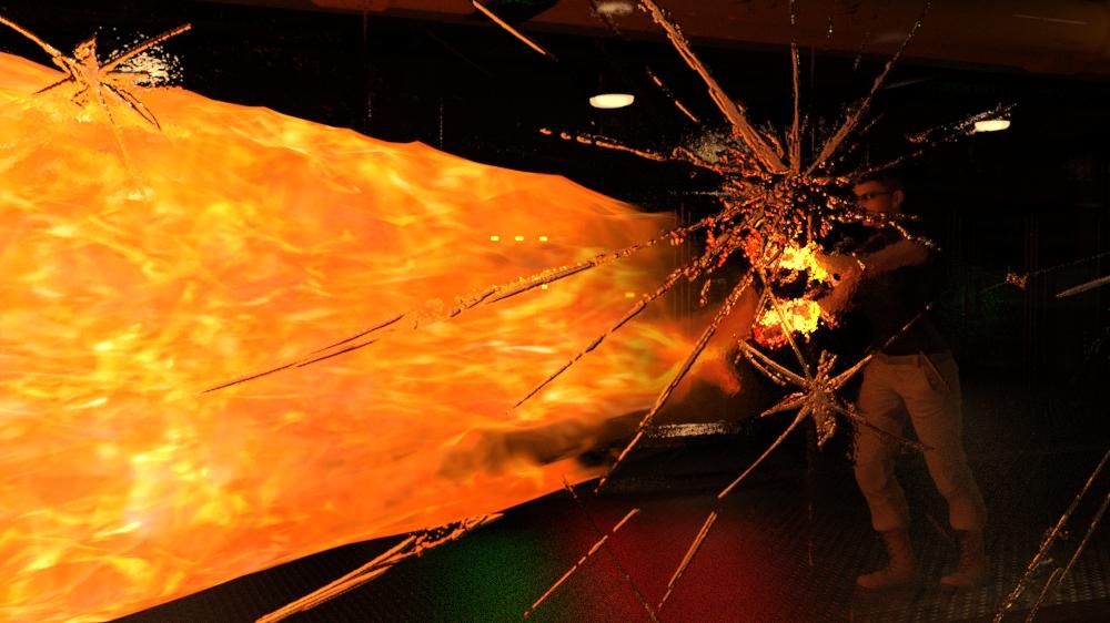
Have you tried coloring some point lights to match the colors you need in the scene? Example would be the green from the horses glowies not that it needs more it's just easier to visualize lol
it's more her upper body seems like its cut out against the background but you did give me a very solid idea...i think if i change the Kelvin Temprature of those two backlights it might just not be so harsh...then blend a little better i'm going to try that. Now we are cooking with fire :) it may not be the intesity but the color aka the temperature balance.
i like the overall render. but as you pointed out yourself, the figure looks a bit like "glued into the scene". while i am still a beginner and do struggle with such cases myself, i couldn`t give much advice.
However, when i thought about how it might be possible to fix this issue, a particular idea arose in my mind...
What if this impression isnt given by the lights or surfaces alone, but amplified by the heavy distortion of the surroundings?
Have you tried to increase the f-stop of the camera slightly and compared the outcome? Not sure if it will achieve anything. but might be worth a try?
(focal length might be involved too - i am still struggling with all the technical details)
i haven`t had a lot of time to play around this month. therefore i am not sure if i will be able to finish a decent project in time myself.
Actually that is a good thought i did try but with the volumetrics and thier tendency to grain i had to cut the backside short and get it out of focus for the overall effect of the wake...but yeah that is a totally good and solid suggestion i did try but i hated what it did to the volumetrics. It is one of those times when you seem to paint yourself into a corner if you know what i mean. I finally think i was able to blend it in just enough but i'll let you all be the judge. I did tone all the lighting down in intensity...however the trick was the back lighting toned lower in temperature to blend into the skin tones versus compete with them that got me to here. Let me know what you all think ..any other suggestions or tweaks you think may be needed? Also in post editing i usually go for contrast but all i did instead was so a little fill flash and clarity ..and came out with this.
taking a bit more time to compare the pictures, i would probably use post work to regain a bit of the front effects depths.
(add a second layer with the old version above new version - then mask out everything but the front effects and play with that layers opacity to blend it in.. -there is probably a faster way - but i am old school - doing things like i did 2 decades ago when there were less options availabe)
EDIT: and yeah, i dunno a lot about these volumetric effects. i only used them last month for the first time. they usually played no role when i was aiming to create a 3d-printable piece)
Yes i think i see what you mean ...let me try a few things ...in that area and see what i come up with. I am not super confident with post working but i think i know where you are going with it. I'll give it a whirl see what i can get from that approach Thank you :)
Morning all!
Ok silly question @dreamcatcherphoto have you tried darkening the diffuse on her skin a tad? You mentioned you didn't like how much she was standing out from the background and that might help some.
@aprilshowers2065
very nice render I love the moodiness you have going on!
The only things I would suggest right off the bat are:
1. The snake is poking through the Tyto shawl around knee height
2. The Helenic top is showing pokethrough into the gown below on the center figure and the one by the wolf. To correct this try either adding or increasing the smoothing, increase the Adjust Upper Torso morph. If the combination of those don't work (they should though) I'd suggest adding dForce to it via the simulation pane!
Very good call...that might do the trick as well..never even though of that.
So I tried a little skin tone adjustment which allowed me a bit more leeway to pop some light and color back into the subject and enviroment in the Post edit stage How does this look now...i think i solved the cut out look issue or at least got it to a tolerable level. So how does this look now ?
So I tried a little skin tone adjustment which allowed me a bit more leeway to pop some light and color back into the subject and enviroment in the Post edit stage How does this look now...i think i solved the cut out look issue or at least got it to a tolerable level. So how does this look now ?
Comments
Sweet!
Hekate
Intermediate Challenge
I kitbashed her outfit from the Elegant Night Dress, Hellenic, Tyto Ensemble and Undead Wizard Outfit, as well as tweaked the textures on the crowns, dagger and key.
i like the overall render. but as you pointed out yourself, the figure looks a bit like "glued into the scene". while i am still a beginner and do struggle with such cases myself, i couldn`t give much advice.
However, when i thought about how it might be possible to fix this issue, a particular idea arose in my mind...
What if this impression isnt given by the lights or surfaces alone, but amplified by the heavy distortion of the surroundings?
Have you tried to increase the f-stop of the camera slightly and compared the outcome? Not sure if it will achieve anything. but might be worth a try?
(focal length might be involved too - i am still struggling with all the technical details)
i haven`t had a lot of time to play around this month. therefore i am not sure if i will be able to finish a decent project in time myself.
Actually that is a good thought i did try but with the volumetrics and thier tendency to grain i had to cut the backside short and get it out of focus for the overall effect of the wake...but yeah that is a totally good and solid suggestion i did try but i hated what it did to the volumetrics. It is one of those times when you seem to paint yourself into a corner if you know what i mean. I finally think i was able to blend it in just enough but i'll let you all be the judge. I did tone all the lighting down in intensity...however the trick was the back lighting toned lower in temperature to blend into the skin tones versus compete with them that got me to here. Let me know what you all think ..any other suggestions or tweaks you think may be needed? Also in post editing i usually go for contrast but all i did instead was so a little fill flash and clarity ..and came out with this.
I feel, it is definetly an improvement.
taking a bit more time to compare the pictures, i would probably use post work to regain a bit of the front effects depths.
(add a second layer with the old version above new version - then mask out everything but the front effects and play with that layers opacity to blend it in.. -there is probably a faster way - but i am old school - doing things like i did 2 decades ago when there were less options availabe)
EDIT: and yeah, i dunno a lot about these volumetric effects. i only used them last month for the first time. they usually played no role when i was aiming to create a 3d-printable piece)
Yes i think i see what you mean ...let me try a few things ...in that area and see what i come up with. I am not super confident with post working but i think i know where you are going with it. I'll give it a whirl see what i can get from that approach Thank you :)
Morning all!
Ok silly question @dreamcatcherphoto have you tried darkening the diffuse on her skin a tad? You mentioned you didn't like how much she was standing out from the background and that might help some.
@aprilshowers2065
very nice render I love the moodiness you have going on!
The only things I would suggest right off the bat are:
1. The snake is poking through the Tyto shawl around knee height
2. The Helenic top is showing pokethrough into the gown below on the center figure and the one by the wolf. To correct this try either adding or increasing the smoothing, increase the Adjust Upper Torso morph. If the combination of those don't work (they should though) I'd suggest adding dForce to it via the simulation pane!
Very good call...that might do the trick as well..never even though of that.
So I tried a little skin tone adjustment which allowed me a bit more leeway to pop some light and color back into the subject and enviroment in the Post edit stage How does this look now...i think i solved the cut out look issue or at least got it to a tolerable level. So how does this look now ?
Thanks for noticing those, @Elliandra! I've adjusted the scarf and fixed the pokethrough.
looking good!
Hi All!
Challenge is now over and I'll have the winners listed shortly!!
Elli
Showcase for the New User Challenge November 2023
Beginners Challenge: Kitbashing Materials!
dreamcatcherphoto - Sable

Shinji Ikari 9th - Version C

Intermediate Challenge: Next Level Kitbashing!
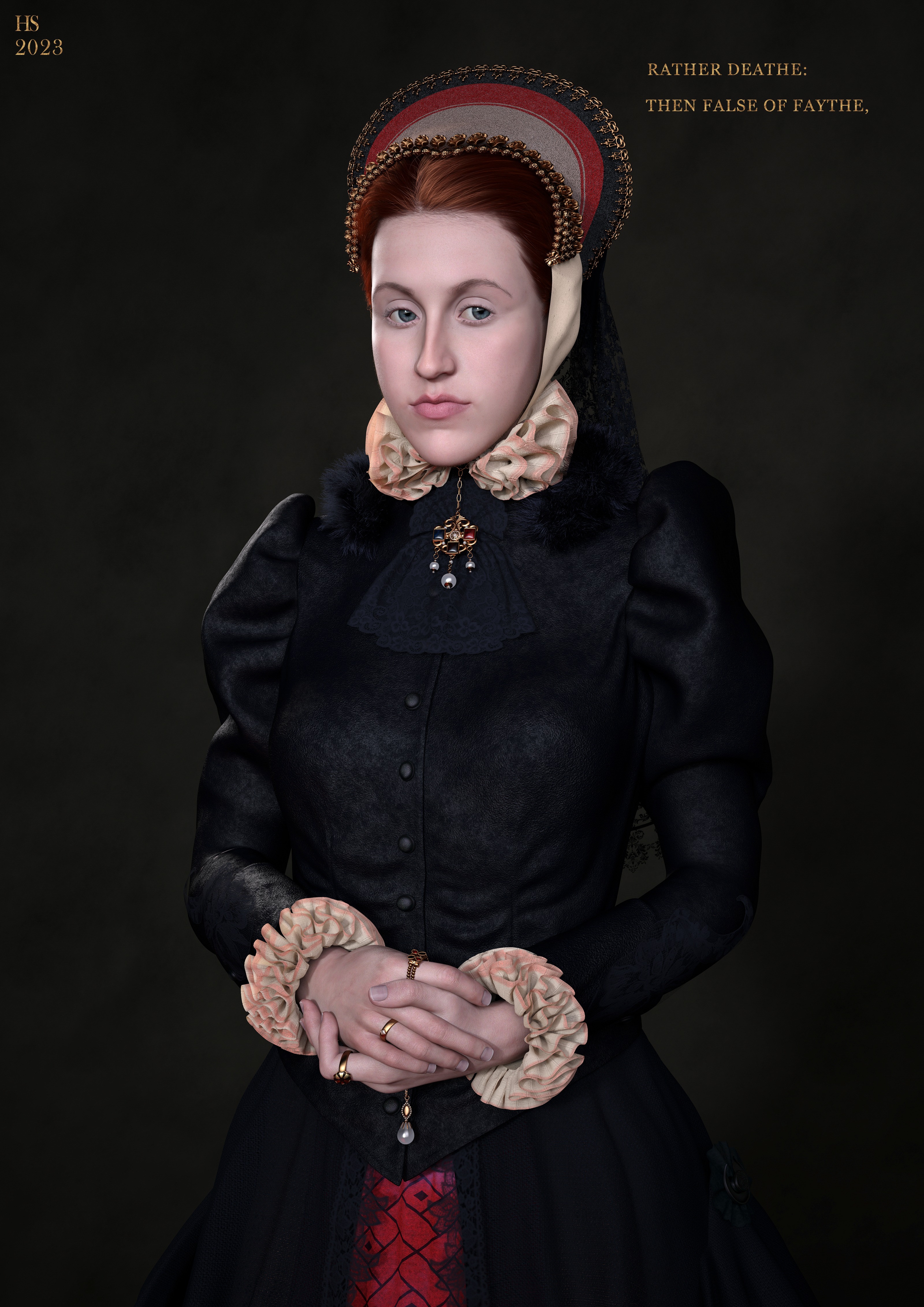
hilbertvanderstaal - "Faith's Hymn - Anne Askew"

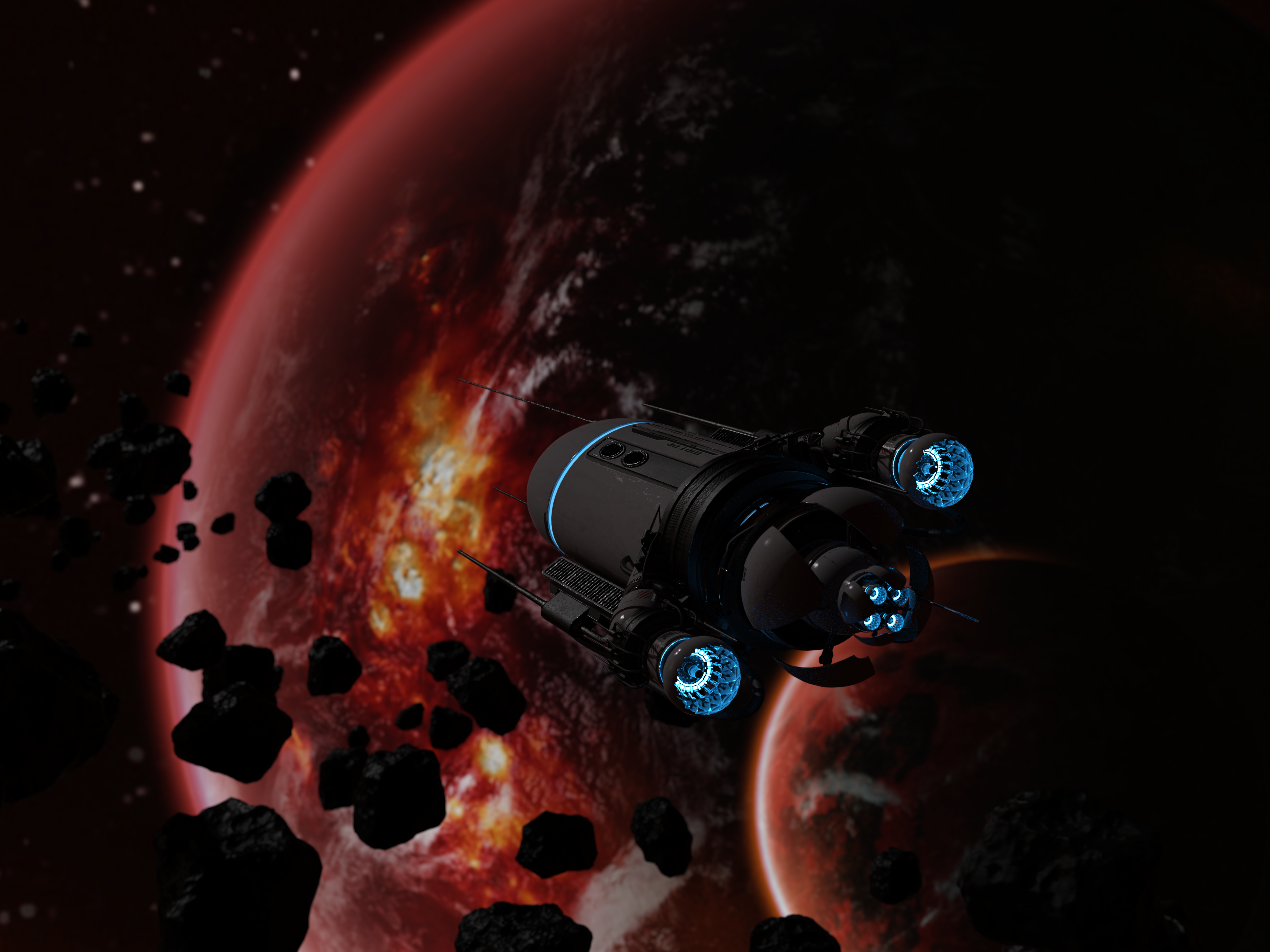
marconft6 - Spaceship full of Robots

New User Welcome:
StarKittee - Say Cheese
Congrats to everyone who participated in November's New User Challenge they were all fantastic and I just wish we could have everyone as winners!!!
Thank you so much, it was such an honour to work on this.
Congrats to all the other winners as well.
Will the images be posted elsewhere? Or is there anything else that will be done with it?
Thank you and Congrats all :) Welcome aboard Starkittee
Congrats to the winners!
Thanks so much and congratulations to all the winners.