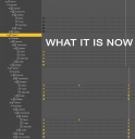
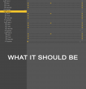
Needed Timeline usability fixes
I animate all the time, and my biggest pet peeve is simple GUI navigation. Let's say you're trying to figure out which body part is bending weirdly. You start by checking Spine 4. All you gotta do is click Spine 4 in the timeline, double-click Properties, double-click Transform, double-click Rotation, and then finally click Bend. Nine clicks. Nope. It's not Spine 4.
Let's try Spine 3. This time, you don't start by clicking Spine 3 in the viewport. You can't get to it with something in the way, so you try to find it in the timeline, which means navigating the nested labyrinth of body parts containing body parts, all of it seen through a timeline with enough breathing room of a sardine can. When you do find Spine 3, you click Properties, Transform, Rotation, and finally. Bend. Nope. Not Spine 3, Either. You keep unpacking all these nested lines, making the timeline even more cramped and messy. It's annoying and time-consuming.
You shouldn't need to select body->properties->transform->rotation->Bend. Why can't Genesis figures just have Bodypart->bend /twist / side-to-side, then have drop-downs for properties? Look at the difference it makes on the timeline for Spines 1-4 in the images.


Comments
+1
I'm also an animator that uses DAZ but unfortunately we're the minority. However, the timeline is the thing used often even by non-animators for various things like dforce sims.
I'm all for a more intuitive animation interface. Various animation making tools could use a refresh, fixes and enhancements, like Animate, Puppeteer, etc..
There is also so much free animation motion files out there but DAZ does not take advantage of any of them or make them easier to use...