FINAL COVER DESIGNS FOR A. E. McCullough NOVELLA "THE LAST SPARTAN: DJ'S MISSION"
 Jake_35533
Posts: 242
For those who did not keep up with the two threads about A.E. McCullough's upcoming novella titled "The last spartan: DJ's Mission", A. E. was looking for a cover for his upcoming novella. A suggestion was made for him to have a contest to see if someone could create a cover similar to the one he already made (which was also good). After many people participated, it was a tight race and two people were selected as winners. CNSamson's cool design "Red Falcon Saturn" was in the lead from the beginning. It then became a tie with CNSamson and me. If I didn't submit more than one cover, I probably would have lost to his cover design. (I really liked Marty D's "Zero day" cover design and Odaa's "The defenders" too).
A. E. wanted my covers to be tweaked a little further to get it closer to his vision of the cover he would want to attach to his new and exciting novella. So I promised to show my progress in a new thread. Here are the three he has chosen and would like me to either improve or add minor additions.
Also: If you have a Kindle or a Kindle app, check out his first novella "The last spartan: Different paths".




Comments
WORK IN PROGRESS
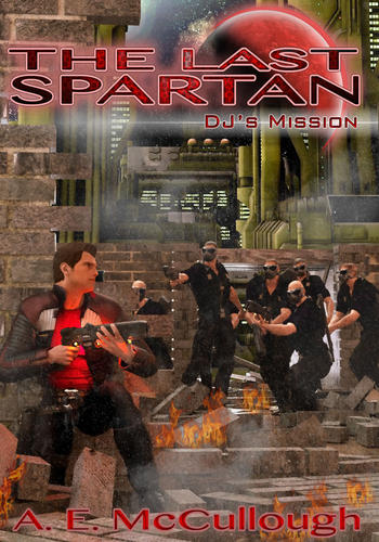
Here is a "re-mix" of the "DJ's Fate" (the one with DJ against the wall) cover design. A.E. and some of his co-workers suggested a better pose because it looked like a video game cover the way it was before (hope I understood correctly). I think his suggestion was actually accurate. So here is hopefully a better version.
WORK IN PROGRESS
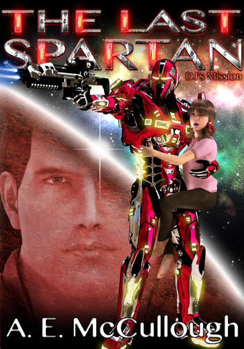
Here is a “re-mix” of the “Eye of the beholder”. A.E. and his co-workers suggested that DJ's daughter looked too old or looked like a "blow up doll" and she should be more behind DJ and peaking out. I think I see what he means because maybe the pigtails and the pink shirt make her look like a "doll" rather than a girl. He also mentioned that his daughter was 12 going on 16 with a liking to tough tomboyish activities. So I needed to make the daughter a little more tomboyish but still girly, so to speak. I hope this is better A.E.
WORK IN PROGRESS
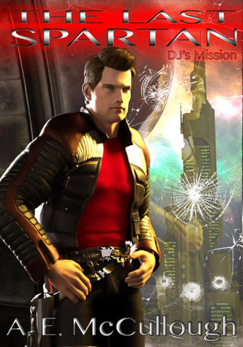
Here is a "re-mix" of "reflection". I am working on fixing the original with the reflection of DJ's daughter in the glass, but here is another version I tried.
I love your work and only have one thing to say, the DJ's Fate re-mix is not the best work you have done. As the Artist I know you did it by the book and it is technically correct, but the stance looks off balance to me as an observer. The rear leg position throw's the render off balance as well as the character. I hope this helps.
A. E. wanted the focus to be on DJ in his red falcon suit. So I am hoping this will be more of what he was looking for. As far as the leg position, I will try to see if I can plant both of his feet on the ground. Right now, this is just a work in progress and will probably be revised several times. Thanks for the critique.
I love this one Jake! Not sure how the title will look on it though. I think it will cover up the top right piece of glass with the reflection in it. Also, one of the reflections should be his daughter - I would think you could replace the bottom left image of DJ with the gun.
As to the re-work of DJ's fate, I agree with the leg placement that Jaderail suggested. But you don't have to take out DJ in plain clothes, still have him there with the Red Falcon standing beside him (ie - Jagger Jax is in the suit near the end of the story). And to keep from using a grenade or something on the gang of thugs, if his daughter was visible being held hostage would explain the standoff.
Keep up the good work and thanks Jake.
The glass shards with the images inside was an experiment. I quickly added some images to see how it would look. My goal is to make sure the daughter is a focus on all the cover designs.
WORK IN PROGRESS
Here is a low res edit of the previous image with the additions suggested. Its very hard to make such a crowded scene in a vertical rectangle since this would better suit a wide scene. I may need to put less guards in the scene.
Here is a test of a re-make of "reflection". There's still some things that can change. Its at a higher resolution and has the red falcon suit and the daughter in the background reflection. Not sure if DJ should be doing something since this is more of a "calm" reflection of things to come.
Thanks for the kind words, Jake! Some random thoughts on your WIPs...
latest version of DJ's Fate: the capture of the girl adds more interest to that right side of the image, which before was just a bunch of thugs and a broken wall. You might be able to zoom the camera out slightly and get roughly the same visual and emotional content with a slightly less cramped feel.
Reworking of Eye of the Beholder: I thought the daughter's face looked a bit "middle-aged" in this, but it may just be the angle-don't have a problem with how she looks in DJ's Fate.
Latest version of Reflection: Really cool idea, this is the one I'd be voting for.
I agree that the daughter adds interest in DJ's fate. I am struggling to get the daughter to look young. I used the K4 skin and of course the kid morph for genesis, but it still comes out looking like a really short adult. I changed her hair color to blond in the reflection to make her look younger. I will a zoomed out version as well to see if that looks better. Its a complex scene and will be hard to get looking right with a vertical image.
The eye of the beholder will be re-rendered with her with blond hair to see if that makes her look younger. I can't think of anything else to improve or add to eye of the beholder as far as the background. I will probably just re-do the daughters hair and leave it at that.
I am not liking the reflection version with the broken glass. It doesn't look right to me compared to the other ones I did. I may work on it a little more and then scrap it in favor of the latest version.
Jake,
I like the new Reflection. I'm going to send to via e-mail to my kindle to really see how it looks and will let you know.
I agree with Odaa about panning the camera back on DJ's Fate....looking for to seeing that tweak.
The same for the Eye of the Beholder. The figures on the blue background just don't give it the whole effect.
As for the breaking glass version of Reflection -- don't completely scrap the idea...one of my buddies at work came up with a suggestion that might be perfect for it but I will have to take more time than I have before work to explain. I'll PM or e-mail you with it.
All in all, I'm liking the progress...Reflection is still in the lead. Oh...one thing, did you mean for DJ's holster to be empty? I just noticed it last night and it got me wondering.
Reflection is (to me) even better after your suggestion for the reflection of the red falcon and daughter. The holster was not left empty on purpose but I didn't think it would matter if it was empty. I was thinking maybe to have the gun in his right hand while his left was on his hip. I may do that to see how it looks.
The eye of the beholder above is a test shot and the blue area is the transparent part of the image. I submitted it to see if I got what you wanted a little better (the daughter behind the leg). I am still struggling to get her looking young enough. I hope blond hair is okay. I will try a different pose for her and then composite it with the original background.
And let me know if the image size 1400x2000 is too big or just right. It puts a strain on my system to render at that resolution. I much prefer the 700x1000 size to have faster renderings. (The bigger size takes 6-7 hours, while the smaller takes 2-4 hours).
That's a good face shape for her IMHO
Jake,
-- You can do the smaller renderings to speed things up until you have everything tweaked just right. As to the size, your big version works great on my kindle.
And as much as I want to see your final versions of DJ's Fate and Eye of the Beholder...I am pretty sold on Reflection. It by far is my favorite.
Two things...1) Yes, its minor but the empty gun holster bothers me. Not sure why but ever since I noticed it, it jumps out at me. Having him hold it works or the gun just in the holster would be fine also. 2) On the original version of Reflection you had bullet holes in the glass....I liked that. Keep the 'cracks' you have now but at least add a couple of the bullet holes (incidentally overtop the Red Falcon -- a bit of foreshadowing there).
Once again...thanks. I'm excited to see the final product and should have my manuscript to my test readers by next weekend.
:-)
Cheers, mate! :) It was a close vote indeed, but I think your entries better captured the spirit of the work.
Anyways, I reposted my image on my dA page: http://fav.me/d5gef9h
Looking forward to entering the next contest. :cheese:
Cheers, mate! :) It was a close vote indeed, but I think your entries better captured the spirit of the work.
Anyways, I reposted my image on my dA page: http://fav.me/d5gef9h
Looking forward to entering the next contest. :cheese:
I think you won as runner up or honorable mention. Check with A. E. because you are entitled to a "prize" as well based on the info on the final submission thread. You are a winner too!!!
I looked at your gallery at deviant art and you got some serious stuff. Some of your images is called "space warriors.", "Stellarstream Force", and "Sector Patrol District B-139" (Hope its okay that I brought it over to DAZ to show others below). Why didn't you submit these to the contest as well? These are fabulous. I think these would have been something A. E. would have loved as a cover design too. I am looking foreword to seeing your next entry in the next contest. This is the first time I have done anything like this. Since I am starting some projects and books and need a site to have people look at my "portfolio" so to speak, How do you start a gallery on deviant art?
Jake is right. I too have looked at some of your work and love it. Actually, I would've loved if you had submitted cover versions #1 and 3 of the pics Jake posted. I still would've like the Red Falcon armor tweaked...but that's simple stuff.
I'm hoping to have my next contest up and running around the holidays. I'll give you a hint, its a fantasy novel but not a mainstream type. More to come later. I want to set up a secure area on my website, where those involved in the contest can read the first 2 chapters to get a feel for the novel and the characters. And my personal target date for this novel is 1st quarter 2013, so I'm not in a rush atm. Too many irons in the fire as it is.
-- Drew
Hi CNSamson,
had a look at your DA page and I must agree with both Jake and A.E. you have some beautiful work and would really like to see more of your work here in the Daz forum.
Much thanks, no problem for posting them here. As for deviantArt, all you have to do is sign up for a free account there and start uploading your images. They also have a Portfolio feature, where you can collect a subset of your gallery under a different url:
http://cnsamson.daportfolio.com/
Thanks; it didn't occur to me to submit those existing images, as I wanted to create an image specific to the story. But glad you liked them as well! :)
Fresh off the rendering press. Here is the latest revision of "reflection". Not sure if I can do much more with the image.
No worries! I like it!
I noticed you added the border again. I will mull over today at work and let you know if I notice anything.
Good work!
No worries! I like it!
I noticed you added the border again. I will mull over today at work and let you know if I notice anything.
Good work!
At this point, you only need to let me know what to take away from the image since I added (I think) everything you were looking for.
Here are two versions of the "DJ's fate". I think the "reflection" cover is the most favorite so I still will submit the remake of the others. I was a little busy the past couple of days and I am just getting back into finishing the covers. I am still working on the shattered glass version to see if I can render the glass instead of making it in photoshop.
I likes....not as much as the final version of Reflection but they are great. Make sure you include them on your upcoming Deviant Art page.