Looking for Feedback on some of my Best
Ok, so I haven't posted much artwork on the forum, because I generally only do single renders of characters and rarely whole scenes. But recently I was trying one older render in particular from a different view angle and thought that I'd post both the old and new render, plus another one, for feedback.
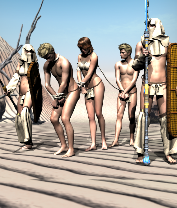
This one is the newest render, titled "Slave Train". It features three captives being led through the desert by two Bedouin-ish warriors. The clothing of the two warriors is not intended to be accurate, as these warriors in particular are from a story I was thinking of writing. This render was done with 3Delight with Raytraced shadows and no postwork. The wrap top the two females are wearing is a freebie from Sickleyield, the headwraps and arm wraps and all the other stuff the characters are wearing is a freebie from Ghastly, the hair is the Wildmane for the men and Aldora for the woman, the spears are from the Atlantida set, and the shields are a freebie by Panko. All figures are Genesis 2 Males and Females. The ropes are from Sickleyield's Tied Up 2 for Genesis 2. The poses are from several places, with editing done. The background was done by placing a desert background image from I think Quinlan, could be extremely mistaken though as I can't quite remember who it was from, onto the beach set to allow the shadows to be cast onto the background.

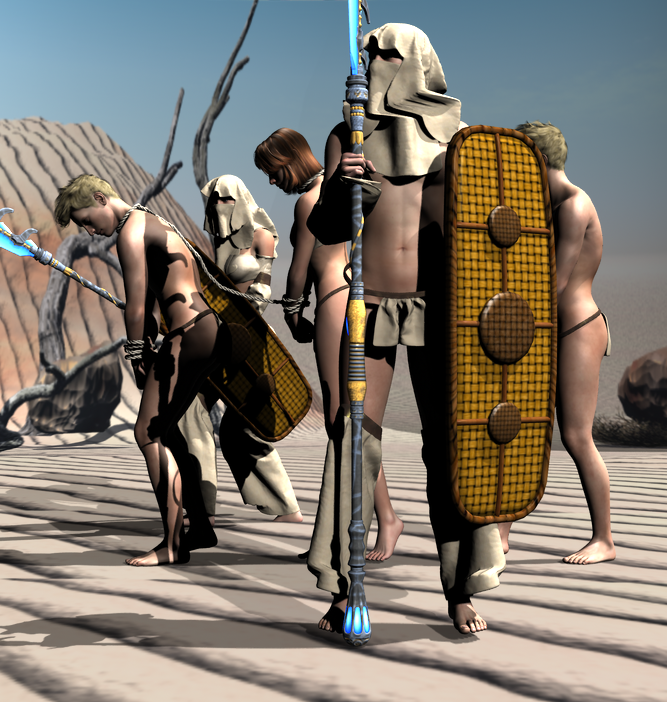
This next one is the exact same image, from a different camera angle.

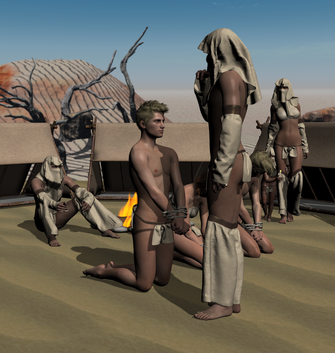
This one is entitled "Inspecting the Captives", and features the three unlucky travellers being examined at the camp by a warrior, while two others look on. The tents and camp fires are from the either Adventurers or Travelers prop set, and the child is a Genesis model. The sand is an image of sand placed on the ground prop.

I am looking for wholesome, constructive criticism and compliments, and any feedback you'd like to give. These images took quite a bit of time to pose the characters, light the scene, and set up the realistic backgrounds (oh my gosh what a pain :P)


Comments
I think you have some good stuff going here.
Constructive thoughts:
One of the things you may want to do is yaw the camera angle and render to make the image look more dynamic. If you have image 1, CTRL Right click on the rotational tool on your camera. This will tilt the camera to the left and create a more dynamic image.
The second thing you might try to do is get rid or reduce the white blown out skin areas in your image. Since this is desert it is going to be bright, but reducing that a little by adjusting your lighting will produce a more pleasing image.
Thanks for the feedback!
I really like the lighting on the first image. It really gives the impression of a harsh deser sun. However the shadows seem a little harsh, I would expect them to be a little less defined in as bright an environment as it is. This is a minor point though if the image is part of a story (which they seem to be).
The horizon is a little bleak though, almost unnaturally so. It is something I fight with on my images as well. The ground is a little off putting as well. I know this is a limitation of the software and the models (as it is also something I fight with). As close up as it is, the waves seem low resolution and painted on. There is no real depth to them which makes them look odd.
The hood on the taskmaster has some funkyness going on. Proably due to the pose of the head and neck. You might be able to fix this by upping the smoothing iterations and collisions. Not sure though, since I am not familar with the model being used.
I like the poses and the facial expressions of the figures, with the exception of the last figure in the slave train. His face seems too emotionless. Same with the slave in the last picture. I would expect there to be at least a glimmer of emotion.
The male slaves hair bothers me too. It is a bit too stylish for the scene. I would expect more matted and dirty, rather than the one you are using. It was more noticable because it was used twice. That made my eye look closer at it.
The last image is my favorite of the three. I like the framing and the detail in it. I only have three issues... One being the facial expression I already mentioned. The other is the texture to the wall, it blends too much with the background. It took me a second to realize that there was a wall there. The image seems darker than it should be. I would have liked to see the brightness levels in the same range as the first image. So that the desert feel comes through.
Now that we are through all of that...
I like the sequential image story you are telling. You can easily make out the story going on, but there is still a lot of detail to take in. The poses are excellent, giving the right feeling of opression. The wardrobe choices and the restraining ropes are extremely well done as well.
Thank you very much sir!
Welcome. By the way, naming the title "some of your best" made it really daunting to comment on. :)
I said "some of" :) I have other good stuff, this just happens to be some of the stuff I spent a lot of time on. Never be afraid to comment on my art. As long as there is no flaming, I take it all as ways to make my art better!
Good. And critiques are in the eye of the beholder.