Opinions please.
 Wilmap
Posts: 2,917
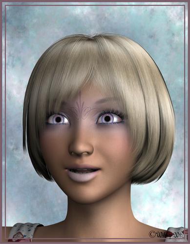
I purchased Luna character for Aiko4 in the sale and this is my first render of her. It took 3 1/2hours to render!:roll:
I'm quite pleased with the result, but would appreciate others opinions.


Aiko4Luna2.jpg
1556 x 2000 - 420K


Comments
It is a great render, I like the bump on the lips and skin, and the hair and lighting is good too.
The expression on her face is a bit funny I thnk. It may just be me, but is makes the image a bit less enjoyable.
I hope you don;t think I am being rude, and I am not trying to put you off. The technical apsects of the render are a lot better that I could normally do, it's just the expresssion that puts me off a bit.
I must also add, that I am no artist of any kind. I hope others reply with their own thoughts too. I hope I haven't offended you, and I love your freebies too :) Well done wilmap!
Thanks Jimmy.
The expression was supposed to be surprised and it was in one of the expression packs I have. Not very good at getting good facial expressions.
Well, she does look suprised. If that was the look you were going for, it is very well done.
I just thought that she is so pretty, and well rendered, that the image could be more striking in some way.
I hope a real artistic person comes along to give their views :)
I like the image, and it is very well done, I just think it could be a lot better in some ways, but so could any of mine.
Waste of time putting this on here if only one person posts!>:(
Three and a half hours to render? What are you rendering with?
The expression isn't too bad, she comes off as pleasantly surprised to me.
How to make it better? you could try with a slightly mare exaggerated expression but it can easily go too far. I thing the main issue is the framing of the render, it's very straight forward, which is fine but lacks flair. if you look at some of the more striking racial renders you may notice they aren't full head and shoulders shots or the camera is at a slight angle, simple little things like altering the angle and zooming in a bit can make a big difference. Also how have you done the lighting? It looks as though a little more work with the lighting could bring it to life, although I'm FAR from an expert on lighting.
Well, that's certainly not me. But I'll give my opinions anyway!
She's a beautiful character and you did a great job with her. I basically agree with JimmyC_2009. The expression might look better if she were looking at the camera, or in some other direction rather than staring straight ahead. I think the lighting is good...there's probably some room for improvement, but I'm not advanced enough to tell you how...it might have something to do with Ambient Occlusion? One thing I like about the lighting scheme is how it looks juxtaposed with the background you selected. And I think the soft shadows are very nice. :)
Wilmap, just to let you know the Art Studio threads take a little bit to take off. Not many users pop in on every visit to Daz and lot's just never look at all. I also second some of the things said so far. The eyes need to be off center some for a more life like look, a little editing of the camera will also help, and for pushing things just a tad more real lot's of us will up a bump map or displacement maps settings so the close ups get a bit of the skin texture look to them. I like the lighting but it might need a extra specular only light to help bring some highlights out better.
One secret with Cose up portraits is to make the eyes meet the viewers eyes, so she is looking straight at you.
IF you look at Jade's avatar you will se that he is looking staright at you, especially if you view the larger version in his profile.
The expression is really cute, goes well with the anime portrait. The details are really pleasant too, and the bump and spec is well tuned. Perhaps a back light, to give a subtle line of light on her shadow side while still keeping the shadow can really help a render. There's always a hint at least of light on the shadow side of an object or person. Something I learned studying fine art.
I disagree, I think the Bump is to low, maybe its a bad map but it looks less like skin than a drawing on rough paper.
Well I beg to differ LMAO
She is young, it's a close up render and by the looks of what I can see of the bump map texture in the render I'd say that particular bump texture is not suited for much more of a bump setting than it already is. A new bump texture with defined skin pores would be ideal, but like most bump textures, they aren't altered much from the defuse texture and only set to greyscale or inverted-greyscale.
If she were older and had a more defined and aged face, I would agree. :-P
I think you hit it on the head, I think it's just a bad map. Not enough detail. The good news is it could be swapped out for a better one if WilMap wished to do so.
LOL. Didn't hit you... Just poked you LMAO!
Many bump maps even in good character packs aren't all that crash hot. A good bump map involves a great deal of work... and knowledge with brushes and digital painting in PS. A true human bump map texture is NOT JUST a black and white, or inverted diffuse.
OT - I'm thinking of rendering Spyro with all the different expressions so I can attach it to my posts... The smilies don't always hit the spot with my expressions.