Banditcameraman's renders
 3dLux
Posts: 1,231
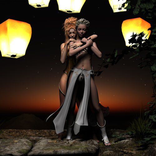
It's now 2.46 AM on this side of the world and I've been working on this for 8 hours ;-P :lol:
Comments and advice most welcome! :-)


The_Magic_Hour.png
1010 x 1010 - 999K
Post edited by 3dLux on


Comments
Just a tad of the pokes in the hand on the shoulder. Still great posing, I know how hard this is. Keep up the good work.
Very nice. Good job!
Thank you so much for the kind words, Jaderail and Frank :)
I can't take credit for the pose; it's from DM's Sisterhood. :red: More than anything else I'm trying to get a handle on lighting first before going onto modeling. :red:
Thanks for the catch on the fingers :)
Lighting is very hard to get down right. It takes a lot of time and experience to get it just right. I've been a vendor for 6 years now and doing my own lights the whole time and I learn something new on each set. They just gradually get better and better. I wouldn't focus all you time on the lighting to start. I'd work on the basics to start. Posing and composition are the most important. With each render play with a new set of lighting but don't make that your primary focus. Like I said that will come with time. But, I do have to say that lighting in this render looks really good.
Thank you so much, Frank.
I guess lighting is my comfort zone because I worked as a lighting cameraman/cinematographer since 1997 so I tend to be a little OC when it comes to that :lol:
Posing and composition is a good place to start, thanks for the tip :cheese:
If you have that kind of backgrouund then lighting should come very easily for you. You will just need to learn how to set them up to your preferences.
Once I get used to working with lights in this environment, it probably will :lol: The non wysiwyg factor take some getting used to; it's only when something is rendered that I know if it worked or not.
Still I have a better handle on lighting tonight than I did last week. I'm beginning to think that the "less is more" approach is the way to go for shadows which is always key for modeling (which is what we used to call using shadows to give the impression of depth/3 dimensionality). And while less is more is the way to go for night, indoor and low light situations I need to suss out how to create shadows for day exteriors :-S
So I thought I'd do a deconstruction of the process to remind myself of what not to do :lol:
After composing the scene and doing a standard render (flat lighting) I lit it using real world techniques...
I realized later that the lantern balloons were actual light sources and not knowing better I put point lights in each one :red:
That, combined with the lights from ForbiddenWhispers's DIY Portrait Lighting Kit was why it took an hour and a bit to get the first effort.
Wasn't happy with it because the girls still looked waxy and the background prop wasn't appearing properly :shut:
The top also proved problematic and the smoothing modifier wasn't really working so I changed it as well as her 'do.
Decided to use the background texture in the prop as a background for the scene. But forgot I was outputting to .png, a mistake I had made with the fiery genesis exercise :red:
Lighting was better (the point lights had disappeared :bug:) so I used an uberenvironment light and a disk light from the kit, which still resulted in hot spots. The light hitting the legs also looked kind of "sourcey" and not motivated by the lantern balloons.
When I checked the render in PS I realized there was no background :ohh: :red:
So I made sure the next render was outputted as .bmp and converted to .png in PS.
And I had deleted the lantern balloons from the scene (I forget why) so I had to relight. Was much happier the result, which was what I posted.
After Jaderail's catch with the fingers I corrected it and addressed a detail that was more evident in a 3030 x 3030 render :zip:
I'm pretty happy with the way it turned out :cheese:
looks great :)
Yes it does. Well done.
Yep, agree looks great
Thank you so much Ivy, Jaderail and Frank :cheese:
Sorry for the late reply; yesterday was really stressful-- and that was the best thing I can say about it :shut:
Anyhoo, on to the next render.
Just this July, I was awarded a Fellowship from Writers Boot Camp. My Feature proposal Dude Looks Like a Lady is yet another reworking of Shakespeare's Twelfth Night . Fans of She's the Man will know what I mean :lol:
One of our requirements is a Project Plan and part of that is a poster which they say is "a good idea" at any stage of development.
Not for the first time am I thankful for 8 years in advertising :lol:
I'd like input and advice for this poster, please. Salient points are the following:
1. Fans of this genre (gender-bending/cross-dressing) are well aware that a major convention/conceit is that even though the protagonist in drag looks nothing like their supposed gender (Roger Ebert said Amanda Bynes looked like "a cute tomboy" instead of a dude :lol: ) the other characters in the story totally buy into it %-P
I'm rather pleased of finding a new way to deal with that. Instead of ignoring it I address it this way: her disguise is so bad that people don't believe she's a dude but when hauled before the Principal she thinks fast and says she's Intersex and taking male hormones for gender reassignment :lol:
2. Since the sport the story revolves around is Basketball, that should come through in the poster. The thing is I need to make her look androgynous or render the basketball jersey in such a way that her chest is obviously a girl's (the most delicate way I can think of saying it :red:). Using the smoothing modifier to address the poke throughs winds up emphasizing that. :ahhh:
How can I address that aside from using the Dynamic Sportswear for M4 (which I don't have) :-S The pictures of that product lead me to believe that the cloth would drape naturally instead of molding itself to her body but is that the only way to go?
Here's the poster design, which was rendered before I found out how to light her properly as well as two renders of her with different 'do's.
Thoughts?
Just dial those down some for less um.. pokie ness.
Thank you so much, Jaderail! That did the trick :cheese:
I think I prefer the second hairstyle (Pyrit) more :-)
Will work on tweaking the pose next :lol:
Tip: You spin a Bball on the end off your finger not the knuckle. :cheese:
Thank you so much, Jaderail :lol:
Adjusted the pose. :cheese: Any suggestions how I can add a motion blur to the basketball whether in Daz or in post?
The pose looks much better. I'm not versed very well in DS (I'm still learning alot) so I'm not sure about the motion blur. I know there is DOF but that isn't what your looking for.
Try this, for some blur. Render your image with the ball in three or four rotated views. In postwork use layers to Blend them together at different strengths then merge all the layers. Select Just the ball when done and add a BLUR filter to just the selected (the ball) area.
Thank you so much Frank and Jaderail :cheese:
Thanks for the tip, JR; will give it a go. :coolsmile:
And while I don't need the DOF effect for this, how do I do that, F? Would that be a blur filter on the parts of a scene I wanted out of focus? :P
For a full break down on DOF and lots of good tips read this thread.
http://www.daz3d.com/forums/discussion/5084/
Sweet :cheese:
Thanks, Jaderail :lol:
DOF is a absolutely wonderful tool once you learn how to use it. I use it in almost all my renders now.
Frank is so right, even just a light touch of DOF in a render can add so much to it.
I'm pretty sure I will too, Frank and Jad :-) I love DOF and one of the things that gets up my nose about the camerawork in this country is the absolute lack of DOF and flat lighting :vampire:
The shoes that came with the basketball uniform looked too cartoony so I bit the bullet and invested in a pair that was more realistic.
I used Jad's tip with the motion blur filter of PS setting the transparency of the different ball angles at 50%
Thoughts?
Looks good but I would keep the Seams all spinning in one direction at one angle. So it spins in just the up down axis not top to bottom. It would look better that way to me. Think Spinning like a top. And a bit less Blur.
P.S. I Like the shoes.
Thanks Jad, will do :cheese:
I was hoping to find something that looked more like basketball shoes but nada ;-P. Luckily there were Chuck Taylor lookalikes :lol:
Here's the latest tweak; trying to strike a balance between slowing down the motion blur just enough and not overdoing the number of visible seams ;-P