Daz 3D is part of 
Connect
DAZ Productions, Inc.
7533 S Center View Ct #4664
West Jordan, UT 84084
Licensing Agreement | Terms of Service | Privacy Policy | EULA
© 2025 Daz Productions Inc. All Rights Reserved.
Comments
Melissa, those images are wonderful. Any chance you could tell us a bit more about your techniques?
...those look really nice in many ways just as good as I've seen with professional software.
So can you outline the process. I used to be a regular on the old Fiddling With Skin in Iray thread but it got so so technical where they were discussing biological aspects, I felt the discussion was going way over my head. I used to paint in oils, and getting skin to look natural and believable came with practise, not having to remember translucency, reflection, scattering, values & such.
I tend to cheat, using a bit of DOF bloom, and postwork filters/effects like old photo styles to get as close as I can.
Seconded; would love to hear what you do with the SSS maps.
Excellent work! I do something somewhat similar to what you seem to be saying (in fact, it may amount to what you're calling "chromatic SSS"). Ultimately, the diffuse map still doubles as the SSS map, but it's filtered into three "layers." Basically, the original map is modified via nodes into a greenish, yellowish, and reddish version. The scatter radius and relative contribution of each layer to the final result is modulated by the strength of the red component in the original map, with the procedurally generated redness map being heightened in contrast first (if I remember correctly). It's an adaptation of a Blender shader that I found online a while ago that produced very impressive renders, and I've never looked back!
I've found that a similar multi-layer approach improves specularity, since a single white-ish or blue-ish layer seems to desaturate the skin too much, especially for darker complexions. My shader blends two layers, one that's more influenced by the underlying skin hue than the other.
Anyway, consider this another vote for you to share some specifics about your SSS maps.
True, but most people just don't really care to bother with it. Sub-surface maps are incredibly important, but so is the actual displacement of the surface micro-details because it works directly with your SSS -- which look lovely on your models, by the way.
Thanks guys! There's really not a whole heap to it. I do play around with bump maps (they are usually too high) and top coat, but each character is different. In terms of SSS, I take the color map and then go to Photoshop. From there, I overlay one of the good G3 SSS maps (for females, Vicky 7 for Vicky 8 with brows removed because it uses the base UV and for males Lee 7 with brows removed because it has no hair painted on and it also seems to match the base male UV). I then use blood vessel maps that I found on DeviantArt and overlay those to the color map and G3 SSS map...creating a new improved SSS for the character. I don't really feel comfortable sharing the link to the blood vessel maps, as the person who posted them isn't the original artist...I don't even know who the original artist is. I only use them for my own stuff. You should be able to pull them right up on Google (and no, I am not the person who posted them on DeviantArt). The maps were made for the base G3F/G8F UV, so ones for male characters will take some manual modification. But that's really it...it's that same formula I use for all characters, and it works out to 100% color map, 25% G3 SSS, 25% Blood Vessel Map.
Some additional notes - Bump is usually too high on characters out of the box. I turn it down on everything but lips and nails. Most characters can benefit from a little bit of Top Coat. To get a good idea of individual shader settings, try opening up one of the base G8 figures to see what those settings look like. The settings themselves are typically pretty good, and I've noticed that Daz tends to use the same (or very similar) settings across the board for their characters. I've used Tasha 8 shader settings as a good reference for females, and Nix 8 for males (and then you just have to swap out the SSS map and maybe play around with the SSS tints). Lastly, don't be afraid to mix and match. I use a lot of what I call "frankenskins"....color map from here, specular map from there, etc. Just experiment with what looks good.
Oh, and don't be afraid to dial up the HD add-on's to above 100%! Also note that I always render my characters at SubD 4.
In the examples attached, I have my tweaked version of Tasha 8 compared to out of the box. I also have Muosso's Reese to show that even top-shelf PA characters can benefit. And lastly, I have my most recent "frankenskin"...which uses the color map from Bramble by Lyoness. For this customized character, I only used the color map from Bramble...the Specular and Bump maps come from Victoria 7 for Victoria 8 (Bramble on the left, my tweaks on the right).
Thank you for sharing your technique - it's very impressive! Unfortunately, the link on DeviantArt from the person who shared the maps have expired as well ... or I didn't search thorough enough, only did a short search.
It's the first result that comes up when searching "daz blood vessel maps g8"...at least for me. The link should be in the user's stash...and they link to it in the description of translucency color. Please note that I do not use the person's shader settings, so this would only be for the actual maps. It's for the AJ Blood Vessel Maps, which I've heard of before, but I guess the original creator has disappeared from the worl do Daz. I'm not entirely sure, as I only started in with 3d art about 18mo ago. From what I've been able to find, these things only exist on this person's DA Stash, so I'd hate to see them go.
Hi melissastjames! Excellent work on those renders.
I have the same blood vessel maps (they're great!), but I'm wondering what layer setting you use in Photoshop when layering them? Do you just use overlay?
And, you're right, the SSS maps on most Daz figures are unfortunately not great.
I know this is aggressively unhelpful, but someone had a render of a kinda gothy looking woman in a fairly dark room that was far and away the most realistic dazrender I had ever seen. I'm looking for it now, but I wanted to post in the hopes that someone might know what I'm referring to and beat me to the punch.
I just use the regular blending mode. Overlay will add to much contrast too it. The goal is to get it to resemble the out-of-the-box SSS maps as much as possible in color/tone...and the 100%/25%/25% typically gets it really close...just with that extra detail the original SSS map was lacking. In some cases I've built off the SSS map rather than the color map...it's kind of trial and error with that. A big part of it depends on how light-skinned the character in question is.
The general skin tone sentiment seems to be "lower the translucency for lighter skin" and that's just so not the right answer when it comes to using chromatic SSS. It might have been the right solution with mono SSS, but definitely not with the new shader. You *need* that high level of translucency to see those amazing details beneath the surface. All my characters use a minimum of 75%...most 80%, and a couple 90%.
I believe I use the same Blood Vessel maps too but I just put them in the skin Translucency Colour map slot and play with the TC and TW parameter dials until they look right. I have no idea if this is the best way to show the veins under skin but I don't know of any other way.
This is a really interesting thread! A lot can be learned from here.
There seems to be a really heavy focus on textures, though. While I do agree that textures and light setup can make or break your render when trying to achieve photorealism, there's a very important part that's not talked about enough on this thread: Anatomy. A lot of Daz models-- the good majority, even-- are missing primary and secondary forms: The more skeletal parts of the subject, muscle flow, and fat deposits. This should be the first thing to think about when creating your photo-real character, because no amount of pretty textures and fancy lights can hide the bad anatomy underneath. I hope this doesn't come off as harsh. This is just something I wanted to add, because it needs to be taken into serious consideration when approaching photorealism.
If anyone's interested, there's a lot of decent info in Anatomy for Sculptor's Artstation.
I also recommend studying these artists:
Hossein Diba
Brett Sinclair
Galal Mohey
Baolong Zhang
I hope this is useful. :)
There are some G8 morph sets that have really taken the models to the next level...such as the ones made by D.Master and K.H. Image Studio. The later G8 figures themselves also have some really good built-in JCM's and MCM's that are miles better than what we had with even the older G8 figures. That still won't help things like jiggle and cellulite, but I don't render animations and I also don't render nudes...so the main focus for me is the face.
You also have to remember that the artists you linked, though absolutely stunning, are not using Daz. They are making a single model for a single piece of art. Everything, right down to the hair and skin, is modeled for that piece. Daz models...figures, hair, clothing...need to be able to be used as reusable, multipurpose assets. That's the tradeoff and the difference between a $60 Pro Bundle with two free Pro Bundlees as incentives and...a piece of art that would probably run someone several thousand dollars, if not more.
I don't know whether I'm on a similar track but I use the G3 and G8 musculature morphs extensively. I find they add a level of realism not available with the base characters and I am not talking about rendering body builders.
The point is to study these artists, not copy them directly. It's still possible to get that level of photorealism, and have them be reusable. Game models are technically reusable assets, so here are some examples you could look into:
Detroit: Become Human
God of War 4
Death Stranding
Hellblade 2
Call of Duty: Modern Warfare (2019)
STAR WARS Jedi: Fallen Order
Shadow of the Tomb Raider
These are all pretty photoreal, and reusable.
The artists I had mentioned previously don't use Daz, but no one can create anything in Daz, anyway. Everything has to be imported, so that's not really something that needs pointing out? Even a good portion of Daz models available in the store had to go through 3rd party software, before the artist called it finished.
I can't presume to know anything about making video games, but the games you posted definitely don't have the level of realism that you linked to with the specific artists on Artstation. Yes, they have great character models for games, but nothing I don't think you couldn't achieve with a Daz model, especially when it comes to skin. Skin is usually where games really lack, at least to me...coming from my screenarcher's level of obsession with graphics.
And yes, I'm aware that all the models used in Daz were not created there. A lot of PA's sculpt in ZBrush and a lot use Blender. I'm not sure what modeling program Daz as a company uses. My point was that those pieces look the way they do because everything was modeld specifically for that one piece. It's not a hair prop that has to fit across all G8 females with auto-fit and it's not facial detailing that has to be able to shape and emote for any character it's put on. I totally get what you're saying, but for me it's like comparing a Dodge to a Ferarri. They're both cars, and there are some pretty noice Dodges out there (I love Challengers) but they aren't hand made and detailed like a Ferrari. (Truth be told, I'd honestly no lie pick a Challenger Hellcat over a Ferrari any day of the week, lol, but that's just me.)
If you're referring to muscle flow, I guess I should clarify that I don't mean visible muscle but rather how the flow of muscle underneath the fat and skin affects a person's face and body. No one really needs medical student level of knowledge of anatomy, but any amount of knowledge can make a hell of a difference when creating photorealistic characters.
....not sure if this technique would work as I tend to build custom skins with SBP3 and Anigenesis II rather than use the stock ones as too many look too "orange" or darker than I want/need even for fair skinned characters like the one in the pic I attached above.
Maybe I should clarify that what I'm referring to is anatomy. Specifically, primary and secondary details. Not deformation, not assymetry, not skin texture, or lighting. Like for example one of my greatest beefs with a lot of Daz models is the paper-thin eyelids, when realistic eyelids are much thicker than what people realize. That's an anatomy issue. Easily tackled, and can drastically improve a character. Does that clear things up? Because I feel like we're talking about separate things.
Also, the top eyelid tends to overlap the bottom, especially in the outer corners, but that detail seems to be missing in some store models. It's almost always the little things.
It's still active...I was just there today. You have to be logged into DeviantArt for it to work.
With chromatic SSS, you can easily control the level of orange in the skin by changing the value of the transmitted color. It's been a long time since I've used Anagenessis 2, but my results on skin were not desirable to me. Depending on a single color map to translate everything from reflectance to bump lead to stuff not looking right, especially when it comes to painted hair.
...SBP3 allows for adjusting the translucency colour which generally has a more "yellow" tint to it. I often adjust it a little more to the pink end and lighten it a bit particularly for fair and albino skins. Is that pretty much the same?
There is also an adjustment for top coat glossiness as well as overlays for veins, freckles, and skin imperfections.
Adjusting these does not affect the thumbnail in the programme so test rendering is still required.
I primarily use Anigenesis 2 a bit sparingly just to give the skin a little more detail when needed.
Haven't played much with render SubD as I have older hardware (don't even go beyond Render Quality 2 in the render settings) and only a few G3 characters come with HD settings (which means having to purchase the HD add-ons which is a budget cruncher).
I honestly don't know what SBP3 is so I'm not sure. With chromatic SSS, you want to keep the actual translucency color white, which makes sense. Underneath our skin, we're all pretty much the same color, which is what the SSS map is for. The tint shaders is where you can adjust for color, as we all have different tints to our skin. I will note, that for folks with older hardware, chromatic SSS absolutely adds onto render time. That's why shader settings packs such as Altern8 say they save render time...because they change a G8 character from chromatic SSS back to mono SSS.
I've been taking alternative approaches for photo-real effects with Daz products...
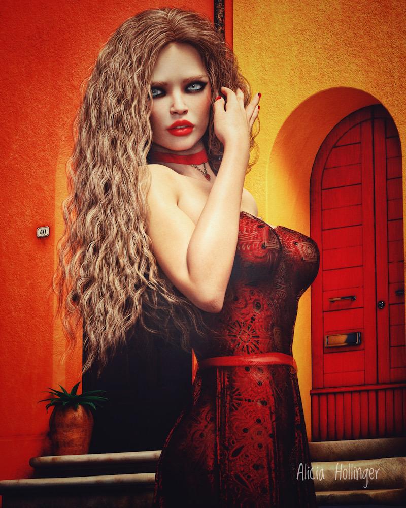
I am trying to make this look like a real magazine fashion ad (which are obviously airbrushed with postwork.) I think the belt looks awful, and am hoping I can paint in something better with Photoshop. I just did basic iPad postwork on this. All critiques welcome to make this come off like an actual photo shoot of a real model in an ad in a fashion magazine. Thanks.
You are aware that G8 figures have "eyelid heavy" morphs...and if that is not thick enough for you, you can always turn off the limits and keep on dialing
This is a fascinating point. It’s also pretty easy to add some of this procedurally in Blender using a noise texture node and running the color output of into a MixRGB node and adjusting to taste. Thanks for the tip!