Adding to Cart…

Licensing Agreement | Terms of Service | Privacy Policy | EULA
© 2025 Daz Productions Inc. All Rights Reserved.You currently have no notifications.

Licensing Agreement | Terms of Service | Privacy Policy | EULA
© 2025 Daz Productions Inc. All Rights Reserved.
Comments
Very soft and subtle
Great glasses Selina,.
if you add a bit of fractal noise to the bump channel,. or even better,. a mixer of two values with a fractal noise as the blender,.
you can enable "Transforms" in the fractal noise and then adjust the scale to create longer streak effects,. or short spot type bumps,. you could also mix togethert a couple of noise functons and have areas with different bump or deformations of the glass.
you can make it quite subtle by adjusting the values of the bump
black and white procedural functions such as fractal noise are great for creating grungey type effects
I'm also old enough to remember snickers as Marathon :)
.
Tim Tams
gotta luv 'em
awesome
.
yep.. been away for our long weekend ... so catch up time now
.
They look delicious! Love the bend in the straw.
.
Hi 3DAGE, did you want to enter these in the voting thread?
cheers
I uploaded a procedural skin texture for V4 set to ShareCG a few years ago. It also includes dynamic eyelash and eyebrow hair. The link to the tutorial I followed and expanded on is dead, sorry to say. I couldn't have linked to it here anyway because it had nudity. If you want to poke around the skin texture, it is pretty interesting. I need to crack it open myself again so that I can refresh my memory on what I was doing. It does use two balck and white image maps as distribution shaders only. They are used to soften the edges between the lip/face shading domains, and the nipple/torso shading domains. They do not use SSS, but it easily added.
https://sharecg.com/v/77436/gallery/7/Material-and-Shader/Carrara-V4-Procedural-Skin-Shader-and-hair
Been busy for the last few days
a final lemon meringue thang
as for entry in the competition,. you guy's go for it,. i'm only havin' fun and enjoying the work you folks are creating. and throwing in stuff
I like modeling and rendering "Stuff",. and i'm glad some other people like what i do,.
i'd also like to imagine that the winner, or prize money will somehow help end the cruel suffering caused by incorrect shader settings and bad lighting.
but it's probably too much to hope for.
Selina :)
just a note on Filter Forge,. I recently updated 7 which I had as a Stand alone app, since I have an older version of Photoshop , and FF changed support with this new version to keep up with the cloud versions,
I also recently found Affinity photo through a post here from EvilProducer,.
Long story ,..short,. Filter forge 7 works as a plugin in Affinity photo,. as do most other photoshop plugins.
i've also just bought Affinity designer pro,. both are ridiculously cheap for what they are.
.
.
.
I think part of the problem is also the image maps. They look like the standard definition maps. Regarding the eyes, there are things you can do to improve them. I always, always, always, ditch the maps with the included reflections. The other thing I do is use the morphs (I thing morphs++) to make the iris convex, and I also increase the cornea bulge. In addition to that, I change the cornea shaders and add refraction and some Freznel, plus I increase the highlight to 200%, and take the shininess to 20-30%.
.
You probably already have them. I believe they come with or came with Carrara. Look in the runtime where you have V4. It would be under poses.
https://www.daz3d.com/victoria-4-2-morphs
https://www.daz3d.com/v4-elite-bundle
https://www.daz3d.com/she-freak-v4
https://www.daz3d.com/michael-4-morphs
https://www.daz3d.com/m4-elite-body-shapes
https://www.daz3d.com/michael-4-muscle-morphs
https://www.daz3d.com/m4-v4-elite-ethnic-faces-bundle
https://www.daz3d.com/m4-v4-creature-creator-bundle
.
.
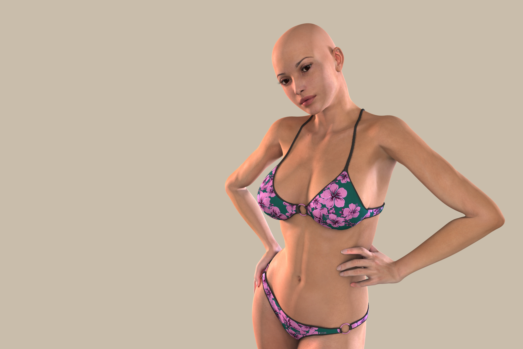
Looks pretty good. I've not been to active on the computer the last couple days. Mostly just able to lurk a bit. I did do a render with the "elite" Reby Sky Carrara optimized textures. The only thing I changed was the tear, cornea, iris and pupil shader.

.
Hi Selina, you are right about the lighting being the key with shaders. This was a hastily thrown together scene to demonstrate the differences between the standard maps and the high res maps. I was actually going to apply my procedural skin to the same model in the same pose for a comparrison, but I was adding SSS to the skin to be similar to the SSS in the Reby textures when Carrara crashed on me. I had not saved the scene because it was a simple set up for an intellectual excersize. D'oh!
I'm afraid the crease in the elbow you mention has more to do with the V4 geometry and not the texture. It is why people liked the Genesis figures when they came out. The joint bends looked better, more natural.
Great point about the eyes. I generally resize the irises and make them smaller.