There be Dragons
 John Sims
Posts: 360
I've been very impressed with the quality of artwork in this forum and take the liberty of offering up some of my images for your perusal.
I've recently been playing around with the new HDR Yosemite packs and thought I'd drag out the old SubDragon LE for a change.
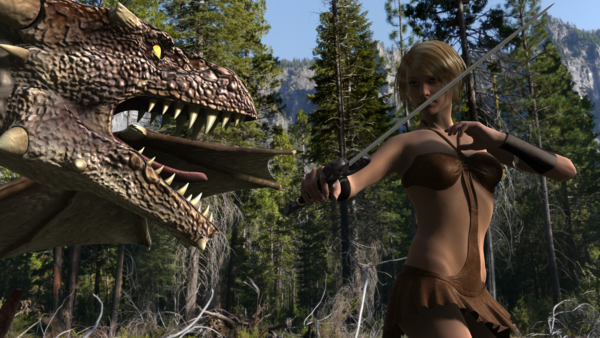

Dragon_Fight_7.png
1920 x 1080 - 4M
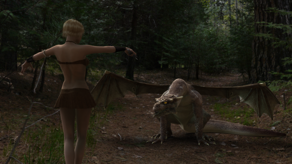

Dragon_Fight_4.png
1920 x 1080 - 3M
Post edited by John Sims on


Comments
A couple more. While it is possible to tie up the ground plane it is quicker and easier to go for a low angle where possible to avoid the complication.
Last two of this set:-
Continuing on from the comment above in respect of the ground plane, I found it was most effective to open up the HDR set and hide the included ground plane temporarily. you can then see what the ground will look like in the finished image.
It is then possible to select the whole HDR set (skydome and lights together) and rotate or translate it until you get the background, light position and ground that best suits the scene. Don't rotate the skydome without the lights or the excellent lighting and shadow match up with the back ground will be ruined.
Once you are happy with the relationship of your models to the background don't forget to unhide the ground plane again. It is transparent in the final render but receives shadows.
Here's one with some ground included. I had moved on the considering a befriended dragon compared to a dragon attack.
I was having trouble figuring out the group plane stuff so I just shot around it..
No dragons here... but maybe zombie rats...
Hairy is the worried cat in the front seat playing with his tie...
there are those who suggest my stuff isn't ground in reality anyway.
Dragons are strange but mutant zombie cats.... :-).
It is possible to obtain an apparent association with the ground but it takes a bit of fiddling and you need to be fairly flexible about your camera angle. You almost need to camera solve the view to the background before finaly positioning your characters.
Another tip - watch out for people in the background. It doesn't matter if your subject is a contempory person but rather spoils things if they aren't.
Another couple using the Yosemite pack......but no dragons.
I'd really welcome a steer on a problem I have encountered on my rendering as demonstrated on the second image of my last post. The skin shows some really unpleasant contour shading which is starting to plague me on a number of renders. I've adjusted render settings to try to reduce it but without much success. In most recent renders I've used the default script rendering setting which has stopped it but (because I can't interrogate the script settings) I'd like to understand what is causing it.
Many thanks in anticipation of your learned comments.
Love the first pic. 'Flight school'
I like the way the dragon's looking intently, like an obedient dog. Nice pose.
Just curious, are they Carrara renders?
Thanks for your comments. I have been quite taken with the dragon and that you can give it some character even with only being able to move his mouth and tongue. While I have tweaked and manipulated the poses I can't take full credit for them as they were originally part of a set.
The renders are all done in DAZ using the default lighting supplied in the Yosemite packs......I am stunned with how good the lighting is a is much to be recommended. It isn't a "one stop" solution, as noted above, and requires some thought and choice regarding the scene (or scenery) and how to get it to work best for your image. I have both the packs so 12 scene options and can often only find one or two out of the twelve that work the way I want for that particular scene.
The most difficulty is in achieving a good grounding but using DoF can be tricky as well as, despite the background image having perspective, because it is all on the inside face of the sky dome you don't get a diminishing DoF relative to the ground plane. It would be easier if the scenes were hemispherical in that respect but you then wouldn't get the nice diminishing and detailed image of the ground.
It is the accuracy of the lighting which makes these sets so good in my opinion. If you break the relationship of the lights to the background it just looks like a model composted on top of a postcard. If the lighting and shadows match it completes the illusion.
Following on from my comments as to how good the Yosemite packs are, this image was created using 3DS Max (with the character exported from DAZ).
To achieve the tie up you have to camera solve the background image first by overlaying perspective lines. This positions the virtual camera and establishes the focal length of the lens. You then need to add in the geographic location, North/South orientation, date and time of day to establish the correct shadow.
The fact that the Yosemite packs achieve this pretty well straight off is stunning.
Back to dragons. This again shows that nasty contouring on the skin as noted in my post above. Any ideas?
maybe not the same, but there are interactions between things that happen illogically.
the attached picture of the dragons and cats is an example
I have a couple of renders where the cats have become martians... totally green...
no others items in the picture affected...
solution in this case was rotate the sun around or up or down or rotate the picture a little
-----
I used to down lighting design, it drives me crazy when a spotlight for instance doesn't look the least like it's preview mode....
I know what you mean but I'm of the view it is relative to my render settings. I have played around to try and remove the grain and artefacts prevalent when using UberEnvironment lighting but end up getting the nasty contouring. It takes so long to do a render that it is impractical to keep changing settings through trial and error.
As I said, I have seemed to get around it using the default script setting, but this doesn't help me to understand where the issue is coming from and how I can cure it.
Your problems could be your render settings, or your surface settings or a combination of both.
Does the lightning come with the set and if so does it use Uberenvironment the settings of that need to be right as well.
If you do a screen shot of your advanced render settings it might help as well as the Uberenvironment settings.
And by the way the dragon you are using is the Subdragon not the millennium dragon
Oh and you have some nipple poke through on the second image (Futurecop) the mods are mighty touchy around here.
I agree, and have concluded that it is my render settings that are at fault as I can avoid the issue by using the default script render. What interests me is how they are at fault and how would I change them to avoid it.
Note taken on the dragon...and now changed.
Nah, it's an imperfection in the leather through abrasion. ;-)
[edit] I've now removed the four offending pixels as I certainly wouldn't want to get in trouble with the mods.
it does rather kill part of the point of the image as I like to do a render without post work, in the main, as it otherwise destroys the purity of the render. While I appreciate there is much to be gained by post production (and we do it for photos and video all the time) there is more of a challenge in producing an unadulterated render. To make a pure render is a skill in combining technical aspects, art and an insight into what is real.
Once you delve into the realms of post production the render just becomes an asset in the final production which is then influenced by other potentially unrelated factors. A pure render is exactly that; it succeeds or fails on the strength of the render. I obviously failed.
you might try defining a very small render area -- and then just try variations on that area...
I wanted to test 40 expressions on the cats so I did a 150x150 pixel box for the render.. took a few seconds a piece
---
including a sample of the green characters.. at first I thought it might be a reflection caused by their green shirts. but even their feet have turned green.
---
the dragons in Yosemite were done with the default lighting plus a spotlight aimed at each cat.
the renders only take about two minutes...
the cpu is an i7 920 from 4 years ago (but a good one at the time) when you say long renders are you talking more than this ?
That was the conclusion I came to as it is only the contouring on the skin which I find offensive. I have a year old i7 running 64bit with 8G ram and an Nvidia GPU. Single renders can take anything from a couple of minutes to several hours subject to lighting and material complexity.
I committed the cardinal sin of changing several render settings at once, rather than try one at a time, so have no doubt set up an issue where one setting is working against another. Just making everything more isn't necessarily the way to go it would seem.
Unfortunately I now seem to have lost the default settings for progressive rendering so if anyone can give me the default numbers that would be a big help.
Perhaps pressing the button bearing the timeless legend "Restore Default Settings" might work. Duh!!!
Some more dragon shots....Dragon in photo studio:~
An old render I found called:-
"It's behind you!"
And another couple of old renders from a batch I called "Dragon Food"
Some more on the "Dragon Food" theme. This was my first try with AoA's Ambient lighting and I am quite taken with it.
A bit of Dragon Flight School.
A rework of one of the images above because the excessive blueness was annoying me:-
No dragons but I love the "Vault Rustler" outfit as modern dragon hunting gear. And if you are hunting dragons you need some serious hardware :-)
You just know this isn't going to go well :-)
I've been playing with AoA's effects cameras which I picked up today with my PC Anniversary discount.
While the fog camera has its limitations it is fast to render and gives a nice feeling of depth.
Nice John, I like the idea with the mech. Reminds me that I really do need to start using those HDRI Yosimite sets.
likewise I've also picked up AOA atmospheric cameras, looks a lot easier than setting up in Luxrender. :-)
Many thanks.
I am certainly much liking the Fog camera. I haven't had much chance to use the volume camera but the results from that have, so far, been less then great I'm afraid.
I also did a back to back today with AOA's area light compared to the Omniarea light. I have to say the AOA light was a bit disappointing. It was slower to render and produced some rather strange effects. That said the omniarea light seems to use a light dome which doesn't work well inside buildings so it is worth having both tools in the box.
A little off thread (who cares) but the results are below:-
The AOA area light shows up the clips on the light stand more noticeably, which is not really an issue, but does some strange things with the girls eyes and also down the front of her shirt.
I also ran the scene in Lux but bad things happened. It seems the figure deformers, or the bump settings or displacement settings meant I couldn't stop the girls abdomen breaking through her shirt. Very strange.