Comic graphics experiments
 _DWM72_
Posts: 0
_DWM72_
Posts: 0
I'm experimenting a lot in the digital kitchen of my paint shop and my other tools. I dabble a lot in my free time, looking for the right result for a comic. I tried black and white sketches, the results were interesting, but still...
My goal is to create something like a painting / watercolor effect. I post some of my results, and want to ask, if it is good enough for a comic. A comic must be likeable; in my opinion, a pure 3D rendered story reads more like a photo story. it's a taste, but I personally don't really like it.
I post some of my experiments, and I want to ask your opinion. If I created a comic with this, is it something that would like or hate? Unnatural or likeable?
You see a lot more details if you enlarge them. If they are too big, you can increase or decrease the picture with CTRL +/-
Thanks in advance.

Daz 3D is part of 
Connect
DAZ Productions, Inc.
7533 S Center View Ct #4664
West Jordan, UT 84084
Licensing Agreement | Terms of Service | Privacy Policy | EULA
© 2025 Daz Productions Inc. All Rights Reserved.
Comments
Those are good results, better than most 3D comics that I've seen. You're never truly going to get comic shading unless you do it by hand, but the small versions of those images definitely look more colorful and less 'cold' than typical 3D renders.
These look nice, I like the style. Nice unified color pallet and poses. Here is some feedback based on my tastes, disregard it if it does not fit your vision or your target audience...
I think the background mountains look great but might be taking away attention from the characters with how detailed they are. I would prefer more line width variation, so the dark outlines have thicker and thinner parts. I think the characters could use more contrast with the lights are darks. If your not already familiar, I would look up the rule of thirds for composition, generally want to place focal points at 1/3rd the width & height of the image. I would make the character's clothing a different color than the wood structures in the background or try not to overlap them so they don't blend together. Hope some of that might be constructive.
Other things you might want to consider checking out if you have not already: Visual Style Shaders, Manga Style Shaders, Camer Magic: ToonyCam Pro, Filter Forge. Although you might already have a perfectly good method for achieving the results your after.
Thanks for the replies. For the lines I did use ToonyCam pro. I use also pwToon often. Maybe I can do something with depth Camera.
The background was a part of the Viking village, maybe I can fade the backgrounds to a lighter color, it's easily done with a depth map. A lot can be done with pwToon, but I have problems with textures and have to replace them with colors. I post some examples of them of what I made a few weeks back.
Looks very good! I like this render style
It's a gorgeous art style. I think it would work wonders for a comic. The only catch I can see is that some models will seem a bit too 'realistic' for the characters. so it's be a bit like watching Who Framed Roger Rabbit, with 'toons' invading the real world. Your last image is an example where the dichotomy is very noticeable.
That being said, I think I need to invest in toony cam pro. I've been meaning to get it for a while, but you know how things get with shiny new releases. It's easy to get distracted by new character releases and post-apocalyptic bases. Or in my case, Stonemason. You can totally blame Stonemason. At any rate, I'll be picking this up today.
The one with the characters looking at the book has nice depth because of the darker background. If it's outdoor during the day maybe fading the background lighter might work, as if there is fog. Atmospheric Effects Cameras by AOA can create really nice depth masks. I agree with HeraldOfFire, the characters do look more stylized than the backgrounds & props. This is something I also struggle with when I try to go with toon style characters. You can try simplifying the detail of the textures or in post but still there are things like object proportions & shapes which are a lot of work to get around if they were not designed to be in a toon style. There are some toon style props & environments by vendors like 3D Universe but I don't think there are that many.
I agree with Herald of Fire. The girl in purple on the steps looks like she was hand drawn and placed onto a 3D render. I don't know how I feel about it. On one hand, it is a style not often seen, and different can be very good. It gets you noticed. On the other hand, just looking at these pictures, I'm finding the juxtaposition a little jarring. I really don't know if reading an entire book would make me get used to it, or if I would be so distracted that I didn't pay attention to the story.
It's going to be your decision in the end for whatever stylistic choice you make. There is no right or wrong. Believe in your work.
Good luck with the comic!
Thanks for your replies and input everybody. It was very helpful.
This time, I used a fog camera, pwToon with lines for variation and ToonyCam Pro. With a lot of postwork, here's the result. Hope to create in the future a real online comic that a lot of people will like.
Thanks.
I'm so in love with the original versions and feel the background doesn't need as much hazing as the modified version. And, frankly, I don't care much for the additional black outlines (though it helps define the chickens). But that's just me.
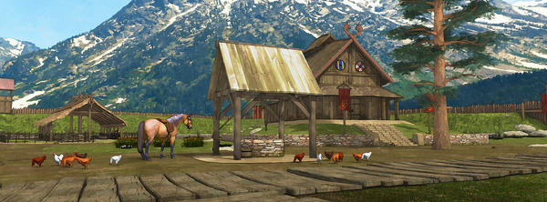
And if you've ever lived out west with high mountains always in the background, they ARE very overpowering and always there.so just a tad of haze will do. Honestly when I look at these I want to be there. Congrats on some very fine work here.
I'll admit, at first glance, I didn't think much. But to tell the truth, as I looked closer, and looked longer, there is something about your style that is REALLY grabbing me. I can't put a finger on it - I'm hopeless at art "technical" terms. :D But honestly, the MORE i look at them, the more i love them.
The one with the girl in purple on the stairs - I keep coming back to it. It's almost like another person said...she's handdrawn on a 3D render. But also kinda not. :D There really is something about that image that I like a LOT.
You've got a VERY interesting style here, and I'm enjoying it.
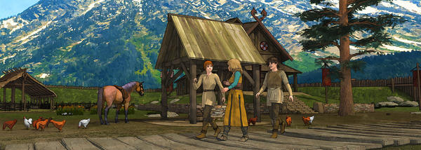
edit: also, the very first image there, with the horse and animals and mountains.. (no people)... WOW. My husband walked past as I was looking and said "oh that's cell-shaded....is that from a new animation?" . I really really LOVE teh effect you got there, and I think I need you to sit down and write out in intense detail how you got it. :D :D (kidding)
I find the style really beautiful too. I really creates a world. Will you share how you created it?
I love it. I guess maybe I'll have to get pwtoon as well, I'd love to capture the same look in my own work.
Just to say I really love where you are going with this. More so because my own experiments are sort of heading this way too though I'm still experimenting mainly with B&W though occasionally colour where I have got the water colours with outlines sort of working.
I certainly would n't post my own images on another thread unless they OK'ed it but also would n't want to start another identical topic. If you fancy talking about this sort of non-realistic rendering on this thread let me know and I'll post up a few of my experiments and perhaps we can both learn from each other. I use toonycampro and both the visual and manga shaders plus the Gimp so knowing whats achievable with pwToon would be great to know.
I think the painterly effect, with some watercolor influences in the first three images works very well. If you click through to the full image the details stand out nicely and you can actually see the line art outlines. The fog effect could work occassionally for specific shots but overall it dulls out the vibrancy of the earlier images. What I did like about the fog image was that the line art actually had some variations in the thickness just as hand drawn comic inkers employ. You're on the right track with this.
3d comics typically have a creepy uncanny valley quality to them, even with post processing effects, and that's what I was expecting to see here... but I was very, very pleasantly surprised. I like the haze in the latest image, though I feel it may be a little too strong; my favorite of all of them, though, is the girl in purple on the stairs. The lines rendered so clean and so well on her that she truly looks hand drawn, and it's fabulous. The background on that one does seem a little hyperreal, but perhaps if you applied your watercolor effect from the other renders to it (or to it more strongly if you already have), it would really come together.
All in all, you are definitely headed in the right direction with this. Great job!
Your pictures are beautifull !!!
But the look has a purpose for "books", not comics
They look great, they remind me of the feel of the Ico playstation game from a number of years back... much grander than an ordinary comic render.
Thanks everybody. I'm seriously surprised with all these positive reactions. That means something for me, really.
To Chris1332: I work the most with Paintshop Photo Pro X and pwToon for DAZ. These last months I also use a program FotoSketcher for additional effects. And I have now other tools added like ToonyCam Pro and a few other for DAZ Studio. I don't have any problem to share knowledge. Others are also curious how they are created. :-)
Here's an old version done with pwToon and a very simple 'painting' effect. Tomorrow I post more about this.
I've been using Daz for my 2D illustration work, but I use it a little differently. I make a rough render of what the scene is going to be and then use Sketchbook Pro to draw the final illustration from the render on my android tablet.
Here's one I call "Tight Pants Fight".
Wow, what a great look! I've been putting thought into making a figure for Genesis2 that has a similar painterly look.
You say you're doing lots of postwork, I'm curious what your workflow for these renders is. Can the outlines be done in a separate pass?
This thread may interest you. Starting from Page 6 and on, there are some translations from Japanese about how the team has gotten the look that they have. It may not all be applicable here, but worth a read if you're interested. They talk about how they're using the depth buffer for their outline effect, but I suspect it's a totally different scheme.
http://www.polycount.com/forum/showthread.php?t=121144&page=6
Here's another one I drew recently that has a more real-media look to it. I really love the new watercolour brushes in Sketchbook Pro. When I first bought the software it only had a couple of marker, pen, and pencils and a "paint" brush that didn't look like paint at all. Now they have a whole slew of pencil brushes and a lot of really nice watercolour and inkwash brushes.
The only thing now I don't really like is the inking pens. It's very hard to get smooth, dynamic line art with them. It's absolutely killer at doing pencils and really sketchy stuff but the smooth inks are tricky unless you work at a very high resolution, but the higher the resolution the fewer the layers. I've found at 1920x1200 I can get pretty smooth inks but I only have three layers to work on which means 1 for my reference image, 1 for my inks/pencils and one for my colours (and once I have the base colours laid down pretty good I can delete the reference image and free up another layer for colouring). That's another nice thing they added a few updates ago, the ability to work in custom resolutions and import a reference image directly to the tablet.
I have there vector based ink program Sketchbook Ink and it really produces nice ink line art, very bold and dynamic and smooth. The only problem is my tablet is pretty long in the tooth so there's a lot of latency when I use it for vector art (none for raster art though).
I have the PC version of Sketchbook that came with my Wacom tablet but I prefer working on my android tablet because it's like a poor man's Cintiq.
Anyway, if you want to make some more dynamic real-media effects to your renders and have an android tablet give Sketchbook Pro a try. I don't know how much it is, it was only $10 when I bought it a few years ago and frankly I'd find it a bargain at more than 10 times the price. Since you're already achieving a pretty decent watercolour effect with your rendering all you'd really be doing is adding a few hand painted embellishments and effects here and there. It'll add a bit of time to your production but I think you'll find in the end the hand drawn touches will really make the effect you're going for pop.
The image with the fog camera & additional line width variation has a lot more depth & contrast. It also puts the focus on the characters, which I assume is what you want. Excellent work.
This one looks more like watercolors, the effect you wanted. But personally, I like how the images looked in your initial post better. It's more vibrant, and it does not look like it was from a 3D render. Even though it does not quite resemble a regular 2D comic, that's not necessarily a bad thing. You've achieved an original look.
On a more nit-picky matter :P, your opening scene is panoramic with no kids. Then kids show up, not bursting into the scene running, but strolling. So there is a significant amount of time that elapse between the first panel and the third. But the chickens never moved. Same positions, same pose. If chickens are pecking for food, there should be change.
Yeah, I tend to notice the oddest of things.
Not all comics look the same. Here are two examples that were pages in actual print comics.
http://nebezial.deviantart.com/art/witchblade-144-preview-201484656
http://nebezial.deviantart.com/art/first-born-issue-2-pg-1-69382821
The outlines are done separated with ToonCam Pro, except for the characters that are done with pwToon.
The link that you gave was very interesting. I found there even another link:
http://www.cgmeetup.net/home/creating-childrens-cartoons-3ds-max/
It was very impressive, all done with 3ds Max, and I wouldn't know any better if I saw it on TV.
Great work! Art that is done by hand has Always something special.
I have similar programs on my iPad, but file exchange is a hassle with the iCloud. At this moment I use my computer more than my iPad. But I agree, it's a good alternative for a very expensive Cintiq.
Thanks for the info and it is very interesting.
This one looks more like watercolors, the effect you wanted. But personally, I like how the images looked in your initial post better. It's more vibrant, and it does not look like it was from a 3D render. Even though it does not quite resemble a regular 2D comic, that's not necessarily a bad thing. You've achieved an original look.
On a more nit-picky matter :P, your opening scene is panoramic with no kids. Then kids show up, not bursting into the scene running, but strolling. So there is a significant amount of time that elapse between the first panel and the third. But the chickens never moved. Same positions, same pose. If chickens are pecking for food, there should be change.
Yeah, I tend to notice the oddest of things.
Thanks :)
Well, you can't expect more of the images, they're experiments, and aren't a part of story :)
I think both ways looks very good to me.
Love esther
By the way, ghastlycomicm, I really am impressed with your work too. Can I see more?
Love esther