Feedback about art style
 Oso3D
Posts: 15,045
Oso3D
Posts: 15,045
I'm debating a shift in the art style of my web comic. A comment about Iray and cartoon style got me thinking...
Experimenting with an 'ink sketch' filter, I really like the look. The lines call out as a stronger style.
Thoughts? I shifted from 3delight to Iray, going from Chapter 1 to 2. Changing styles going from 2 to 3 might make sense...
Here's a sample image, regular vs. inked.
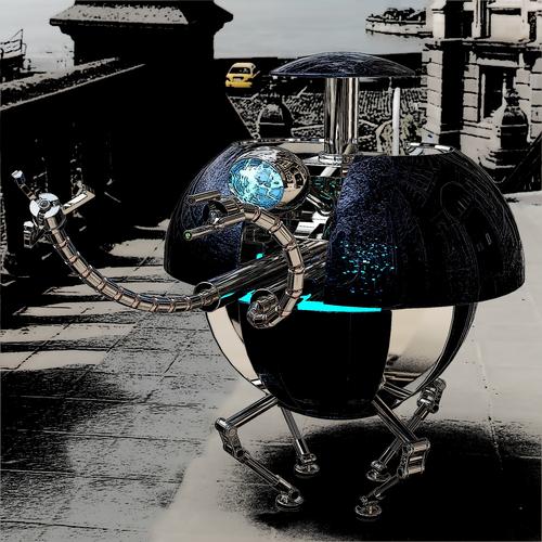
Ball_robotinked.jpg
2000 x 2000 - 3M
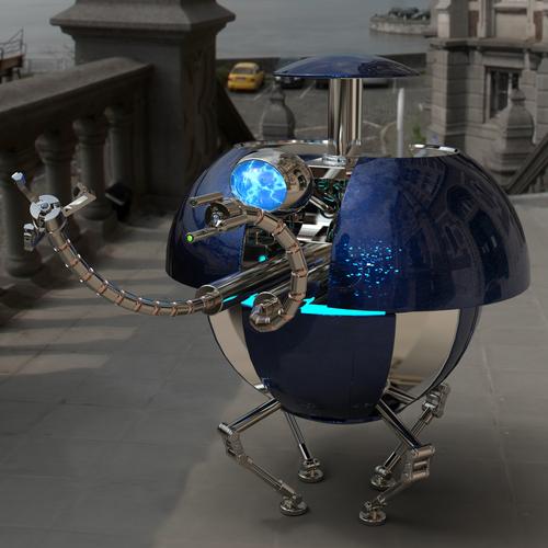
Ball_robot.jpg
2000 x 2000 - 1M
Daz 3D is part of 
Connect
DAZ Productions, Inc.
7533 S Center View Ct #4664
West Jordan, UT 84084
Licensing Agreement | Terms of Service | Privacy Policy | EULA
© 2025 Daz Productions Inc. All Rights Reserved.
Comments
Iray or any unbiased renders don't seem like a good match for art/sketch style images, stick 3Delight. Much too 'busy', try simpler textures and fake reflection maps
I agree with Jestmart, a toony style needs simple colors and shading. You might be able to give a photorealistic Iray render a painterly style with enough postwork, but not a toony one. That second render looks to me like so many other webcomics that run their photos or art through the usual Photoshop filters and call it a 'comic' style.
Now of course it's entirely up to you - what you like best is important. The first render is very good though, and I think if you added good word balloons and lettering (and that can absolutely make or break a comic), you'll have something that will stand out from the many 3D comics out there.
Here's a more accurate example of how it would look, from my webcomic.
Warning, blood.
SnowSultan's right, and the second example is worse. The fist render has that "LOOK-I-DID-IT-IN-3D!!!!!!!!!" look or as I like to call it, the Uncanny Valley Motor-Inn look. The second looks like the first one got Photoshop-filtered.
Not to squeak too loudly on my tricycle horn, but there are several good 3Delight shaders in the store or for free to break away from the generic-3D look of the Uncanny Valley Motor Inn.
Oy, possibly another bad example. The two blondes are robots with very fakey hair. The only obvious humans are over to the left.
But, let's put it simply... I'd rather spoon out my eyes with a rusty spade than deal with 3Delight's fakey lighting.
I AM, however, getting the sense that I should work more on how the post stuff is done.
To give a different perspective. I think the normal Iray renders look good, but for an action comic they're a bit too 'real' and that causes them to lose some of the drama. There is definitely the danger of falling into the uncanny valley and everything looking a bit creepy.
The inked images, on the other hand, I think have that Sin City feel where everything looks more dramatic and lively. I think back to my days of reading X-men comics and think that bold colours, strong shadows and inked lines are a better art style for this type of thing. So I'd say that even if it has been done before by other online comics, theres probably a good reason for that and I say go with it. At the end of the day its the story, characters and dialogue that will really sell the comic.
I'm reminded of the Age of Apocalypse series within the X-men franchise that used a very different art style to the base comic - more cartoony. It didn't ruin the series though because the story was still very compelling.
I don't blame you at all about 3Delight lighting - I can't stand it either. Much prefer Iray.
Translation: I like the inked style better :)
I like the look of the ink sketch filter, but I think you need to have a brighter, lighter iray render as the base.
The problem with the 'toon' examples is that they have the giveaway "I used Poster Edges filter!" look that every Tom, Dick, and Harry's webcomic has. You can see a bunch of tutorials here that while quick and fairly simple, all give that filtered comic look.
http://inspiredm.com/10-comic-book-photoshop-tutorials/
While TL155 is right about the normal renders looking too "real" for a typical comic, they're also MUCH higher quality than typical webcomic renders. If your goal is to get attention for your webcomic, I think those realistic renders would catch someone's eye more than the filtered ones simply because we've already seen those done to death.
This is going to sound blunt, but after 15 years of experimenting, I believe it - for now - to be true. It is impossible to get a truly hand-drawn look from a 3D render without manual postwork of some kind. Big studios can't even do it, and they often write their own software for their productions. It has to do with the nature of 3D and how a machine calculates light, shadow, and line work versus how we perceive "what looks right" when drawing in a cartoony or non-realistic style.
Do what you like, but don't knock yourself out trying to get a true comic look out of 3D renders.
Aaaah... I'm not trying to get a true hand-drawn look. I'm just trying to get something that looks striking and interesting.
If everyone goes 'yep, that's a photoshop (well, paint.net) filter,' I don't care, so long as they go 'and it looks neat.'
That's the tricky bit. ;)
Well then it's easier, you do what you and the fans of your comic like best. ;)
If you decide to go with the second style and the lines, one thing you might try is to apply the filters to a copy of your render on a new layer (if Paint.net has layers, I'm not familiar with it), then use an eraser (or layer mask if you can) and delete any excessive lines that make areas too dark or make a character's face look weird. Putting even a little 'human touch' on commonly used filters can make them look more unique.
I think I'm going to experiment with rendering in stages. Maybe do a render with essentially even lighting for color, and then another pass for lighting, and then manipulate the two so that I can... well, not get cell shading, exactly, but more even lines (and better control over that).
Inked looks more striking and interesting to me. Realism looks like the beginnings of a porn comic.
Experts like SnowSultan will be able to recognise what you've done to achieve the look, but most of your layman audience won't think twice about it.
Watchmen, Walking Dead, Sin City, X-men... all very successful comics that used a similar style to what you're trying to achieve. When those comics were made it was possible even then to draw more realistic characters and scenes but they didn't because they recognised that the style they used was more dynamic and exciting. I say, if it ain't broke, don't fix it ;)
have you considered using the Sketch Cam or Toon Cam available in the store?
I think the key (for me at least) is to get something that looks relatively clean. For instance the render with the robot doesn't work at all for me there's too much variance in the original render so your image program is making too many lines and the result is very muddy and messy. The second one works much better especially when zoomed out a little bit. If you can get all of the created lineart on its own layer and clean it up a hair I think it would look amazing.
Another test. Did a little more complex jiggery pokery with it...
Like the last one allot!
And using this style with the ball robot:
Yep, perfect! Thats a comic I'd read... so long as the story was good of course :)
The style really animates the scene.
Make sure to use bold colours though, or you'll end up with everything looking like its coated in sugar.
Thanks for feedback. And if you are curious, my webcomic so far is in sig. Heh.
But it sure is fun tryin! I've been at it for over 2 decades now . . .
http://www.daz3d.com/forums/discussion/54697/
Absolutely zero manual post work done on these, which is what makes animation possible:
http://www.daz3d.com/forums/viewreply/813425/
BTW timmins.william, I think your work is great - please keep at it and keep posting!
- Greg
@Algovincian Those are extraordinary renders, although I still don't quite understand how you got them even after reading your explanation. ;) I'm going to go back and read them more carefully now, lol. You keep saying you're not a 3D artist, but you must know Shader Mixer better than 99% of the 3D artists here to be able to come up with that.
Thanks for sharing!
Amazing stuff, Algovincian! And thanks for the encouragement.
Here's a quick version of an image I posted earlier, Logan with Ninive skin. (Even-toned skins work very nicely for this process, since the details are going to be lost anyway and just end up as annoying noise)
Thanks, SnowSultan. If anybody has any questions about the process, please post them in the Non-photorealistic Renders (NPR) thread, rather than here:
http://www.daz3d.com/forums/discussion/54697/
I'd be happy to try and answer them as best as I can - not that I've done a good job explaining so far!
I just checked out your DA page, SnowSultan, and . . . wow! If anybody hasn't done so yet, do yourself a favor and head on over:
http://snowsultan.deviantart.com/
Glass kickin' just jumped off the page and kicked me in the face! Really amazing work.
- Greg
You're a skilled storyteller, timmins.william: unfortunately I had to leave the Far Shoals for the moment...
I work primarily in 3Delight (as you likely guessed), but I've seen some splendid stuff come out of iRay, and I'll have to say your comic now joins the list. That third contrast-set is actually superb.
@Algovincion: Thank you very much, I'm glad you liked that image of mine! It's not an NPR render though, more like a heavily-PSD'd one. ;)
You actually explained your technique well, I just didn't catch it at first that you use an external algorithm for actually doing the line work. It sounds like you have an extremely complex but very powerful system behind the scenes of all this. :) Should you ever need any assistance on the Studio/postwork end of things, I'd be glad to try and help if I can.
@Timmins: I don't remember if you can use reflection maps on Iray surfaces, but they might give you better results with that sort of style than raytraced ones because they're less detailed and won't pick up so many little specks.
Thank you!
'third contrast-set'?
SnowSultan:
Another thing I can do is use smoother-toned skin, not so much of the bump/normal stuff ... smooth it out. ;)
timmins, I think you're onto something. The last two examples of the postworked ink style you posted (hands in the well and the face close up) look great. The thing they remind me of in a good way is the '70s comic work of Richard Corben, as seen in old issues of Heavy Metal. Look up his old comic work like DEN if you aren't familiar with it.
He was using some very unorthodox creation processes in his comics in those days, giving him very unique results. Kind of a combination of photorealism and cartoon that wouldn't become commonplace for another couple of decades with the advent of digital tools. I don't know much about his process for sure, but rumors I've heard over the years were that he was very knowledgeable about the technical aspects of color printing and did all his own color separations manually, and that he freely incorporated photographs of custom made clay sculpts of characters into his panels to get his freakishly real but still cartoony looking imagery. Anyway, somehow the stuff he was doing in the '70s often looked like it was rendered in DAZ decades before such a thing was possible, and he was a very popular fantasy comic artist often credited with inventing the modern graphic novel. If you didn't know his work already, or hadn't thought about it in that context, I thought it might be inspirational to you. Good work!
The best for comic post production is rendering using Interactive mode if you really want to use Iray , it will produce minder detailed shading and will be better for post production
Interesting, Pearbear! It did have an old style graphic novel look to it that was cool to me. Hmm.
Mec4D: Oh, interesting... I hadn't even tried using Interactive mode. I'll have to experiment, thanks!
When I was looking at timmins.williams headshot post, I was put in mind of some of the early attempts at taking sepia or black and white photographs and colourizing them.
It has been interesting following the discussion here, although it is well outside of my personal comfort zone.