KindredArts Projects [Commercial]

KindredArtsKindredArts Posts: 1,239

Hello!

Instead of posting projects individually, i will post any commercial works in progress here. I am open to any requests, feedback or comments on current or future projects, so don't be shy.

SciFi Bastion:

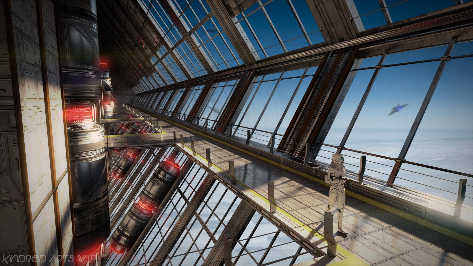
I've been skimming through some fantastic sci-fi concept art recently, and tried to merge the architectural styles and color combinations i've come across into one vast scene. It's big, but as always - textures are re-used intelligently and there's plenty of room for light to enter the scene, so it renders very quickly.

The main figure is complete, now it's on to props, decals (to break up the floor tiling), and a 3DL port. If you have feedback, or maybe something you'd like to see included in the scene, let me know.

Note: This is a work in progress, and subject to change.

BastionWIP.jpg
1920 x 1080 - 2M
Post edited by Chohole on
«13456

Comments

  • SorelSorel Posts: 1,395

    This looks really good so, can't wait to see more developments! 

  • xyer0xyer0 Posts: 5,947

    This is glorious! Since you have finished the main figure already, any modularity you can incorporate into the structure would be greatly appreciated and would lend to flexibility and kit-bashing. For instance, if the cylinders (with red lights on them) could be hidden or even moved, it would be great. The ability to remove the guard rails so that the catwalk can be extended into a floor (in order to create a penthouse restaurant or office) would also be nice. By the way, I love Cafe Luca, and I would like to suggest that when you make your next project requiring lettering on walls that you go for a more stylised font so that it looks more like a logo. Keep up the great work. This is very exciting!

  • KindredArtsKindredArts Posts: 1,239

    This is glorious! Since you have finished the main figure already, any modularity you can incorporate into the structure would be greatly appreciated and would lend to flexibility and kit-bashing. For instance, if the cylinders (with red lights on them) could be hidden or even moved, it would be great. The ability to remove the guard rails so that the catwalk can be extended into a floor (in order to create a penthouse restaurant or office) would also be nice. By the way, I love Cafe Luca, and I would like to suggest that when you make your next project requiring lettering on walls that you go for a more stylised font so that it looks more like a logo. Keep up the great work. This is very exciting!

    Thanks Max. The Tankers are rigged to bones and are hideable. I'll go back and see if i can split the rails out to bones without having to reverse engineer to much. I'll also see about adding a free floor cap for the large gaps so you can build onto them. It is built out of modular segments, so i can add extra segments as optional props, but snapping might be an issue.

    I agree on the luca sign. The reason i didn't go all out with the sign, is that i thought people would want to swap it out for their own signage. i'll keep it in mind for the future.

  • nicsttnicstt Posts: 11,715

    Damn, that looks great.

  • xyer0xyer0 Posts: 5,947

    This is glorious! Since you have finished the main figure already, any modularity you can incorporate into the structure would be greatly appreciated and would lend to flexibility and kit-bashing. For instance, if the cylinders (with red lights on them) could be hidden or even moved, it would be great. The ability to remove the guard rails so that the catwalk can be extended into a floor (in order to create a penthouse restaurant or office) would also be nice. By the way, I love Cafe Luca, and I would like to suggest that when you make your next project requiring lettering on walls that you go for a more stylised font so that it looks more like a logo. Keep up the great work. This is very exciting!

    Thanks Max. The Tankers are rigged to bones and are hideable. I'll go back and see if i can split the rails out to bones without having to reverse engineer to much. I'll also see about adding a free floor cap for the large gaps so you can build onto them. It is built out of modular segments, so i can add extra segments as optional props, but snapping might be an issue.

    I agree on the luca sign. The reason i didn't go all out with the sign, is that i thought people would want to swap it out for their own signage. i'll keep it in mind for the future.

    Thank you for your efforts and graciousness. From the release of Reception Area I knew there was something special about you. 

  • KindredArtsKindredArts Posts: 1,239
    edited January 2016

    Many thanks to everyone above, it's a great boost.

    I've split out as many bits as possible without going over the top with bone heirarchys. Some bit's can also be hidden with material presets, hope that's ok. I'm still working on decals and the optional modular parts so you can swap parts in and out. Unfortunately, the lack of vert snapping might make it a bit tedious to get things in the right place, but i don't think there's any more i can do.

    I'm also going to play with the materials a bit more, as i did a low light test and the rear wall shader could look more interesting. Render below:


    BastionWIP2.jpg
    1920 x 1080 - 2M
    Post edited by KindredArts on
  • KA1KA1 Posts: 1,012

    This is looking fantastic!! 

  • alexhcowleyalexhcowley Posts: 2,386

    This reminds me of one of the scenes in the Paul Verhoeven movie "Total Recall" except that I think your production designer is better than his!   I shall await further developments with interest.  Incidentally, I agree with Maxamillioin's request for removable guard rails.

    Cheers,

    Alex.

  • KindredArtsKindredArts Posts: 1,239
    edited January 2016
    KA1 said:

    This is looking fantastic!! 

    Many Thanks, KA1!


    This reminds me of one of the scenes in the Paul Verhoeven movie "Total Recall" except that I think your production designer is better than his!   I shall await further developments with interest.  Incidentally, I agree with Maxamillioin's request for removable guard rails.

    Cheers,

    Alex.

    Man i love Verhoeven! Robocop, total recall, starship troopers (yeah, i know nobody else liked it), awesome movies and great set design.   We have come a long way from matte paints and miniatures.

    The doors are moveable, the tankers/sections/end caps are hideable, and the guard rails are hideable too - but i've had to do it through a material preset which i will provide one click presets for. Since i will be providing extra pieces, you can slot in a new piece wherever you like, hide the fences and pop in a floor cap (also provided) to build upon. I hope that's ok for everyone, let me know if you have issues with it and i'll find a workaround.

    Aside from that, the materials are just about done, They're a tad more worn and detailed now. In addition, i'd quite like to add large signs or billboards (A bit like airport terminals) but i have no idea where to hang them from. Again, Thanks for the comments everyone!

    BastionWIP3.jpg
    1920 x 1080 - 2M
    Post edited by KindredArts on
  • Sfariah DSfariah D Posts: 26,295

    I sometimes watch something nobody likes then end up liking it.  I watch it to see why people think it sucks.  Not always true. I still find family guy disturbing.


    Back on subject. Love the look that this is going.

  • xyer0xyer0 Posts: 5,947
    KA1 said:

    This is looking fantastic!! 

    Many Thanks, KA1!


    This reminds me of one of the scenes in the Paul Verhoeven movie "Total Recall" except that I think your production designer is better than his!   I shall await further developments with interest.  Incidentally, I agree with Maxamillioin's request for removable guard rails.

    Cheers,

    Alex.

    Man i love Verhoeven! Robocop, total recall, starship troopers (yeah, i know nobody else liked it), awesome movies and great set design.   We have come a long way from matte paints and miniatures.

    The doors are moveable, the tankers/sections/end caps are hideable, and the guard rails are hideable too - but i've had to do it through a material preset which i will provide one click presets for. Since i will be providing extra pieces, you can slot in a new piece wherever you like, hide the fences and pop in a floor cap (also provided) to build upon. I hope that's ok for everyone, let me know if you have issues with it and i'll find a workaround.

    Aside from that, the materials are just about done, They're a tad more worn and detailed now. In addition, i'd quite like to add large signs or billboards (A bit like airport terminals) but i have no idea where to hang them from. Again, Thanks for the comments everyone!

    Is it too much to ask for you to provide the more pristine, less worn (pre-aged) materials as well? This way the set can be used for high-end utopian purposes or (with the worn textures) military dystopian scenes. I had envisioned using this for an upscale corporate interior. Thanks for your time.

  • KindredArtsKindredArts Posts: 1,239
    KA1 said:

    This is looking fantastic!! 

    Many Thanks, KA1!


    This reminds me of one of the scenes in the Paul Verhoeven movie "Total Recall" except that I think your production designer is better than his!   I shall await further developments with interest.  Incidentally, I agree with Maxamillioin's request for removable guard rails.

    Cheers,

    Alex.

    Man i love Verhoeven! Robocop, total recall, starship troopers (yeah, i know nobody else liked it), awesome movies and great set design.   We have come a long way from matte paints and miniatures.

    The doors are moveable, the tankers/sections/end caps are hideable, and the guard rails are hideable too - but i've had to do it through a material preset which i will provide one click presets for. Since i will be providing extra pieces, you can slot in a new piece wherever you like, hide the fences and pop in a floor cap (also provided) to build upon. I hope that's ok for everyone, let me know if you have issues with it and i'll find a workaround.

    Aside from that, the materials are just about done, They're a tad more worn and detailed now. In addition, i'd quite like to add large signs or billboards (A bit like airport terminals) but i have no idea where to hang them from. Again, Thanks for the comments everyone!

    Is it too much to ask for you to provide the more pristine, less worn (pre-aged) materials as well? This way the set can be used for high-end utopian purposes or (with the worn textures) military dystopian scenes. I had envisioned using this for an upscale corporate interior. Thanks for your time.

    Yeah, no problem. The textures are actually quite clean, it's just material trickery to give a more worn effect, but i'll make sure there is a clean preset. If you have any problems after the initial release i'd be glad to help.

  • xyer0xyer0 Posts: 5,947
    KA1 said:

    This is looking fantastic!! 

    Many Thanks, KA1!


    This reminds me of one of the scenes in the Paul Verhoeven movie "Total Recall" except that I think your production designer is better than his!   I shall await further developments with interest.  Incidentally, I agree with Maxamillioin's request for removable guard rails.

    Cheers,

    Alex.

    Man i love Verhoeven! Robocop, total recall, starship troopers (yeah, i know nobody else liked it), awesome movies and great set design.   We have come a long way from matte paints and miniatures.

    The doors are moveable, the tankers/sections/end caps are hideable, and the guard rails are hideable too - but i've had to do it through a material preset which i will provide one click presets for. Since i will be providing extra pieces, you can slot in a new piece wherever you like, hide the fences and pop in a floor cap (also provided) to build upon. I hope that's ok for everyone, let me know if you have issues with it and i'll find a workaround.

    Aside from that, the materials are just about done, They're a tad more worn and detailed now. In addition, i'd quite like to add large signs or billboards (A bit like airport terminals) but i have no idea where to hang them from. Again, Thanks for the comments everyone!

    Is it too much to ask for you to provide the more pristine, less worn (pre-aged) materials as well? This way the set can be used for high-end utopian purposes or (with the worn textures) military dystopian scenes. I had envisioned using this for an upscale corporate interior. Thanks for your time.

    Yeah, no problem. The textures are actually quite clean, it's just material trickery to give a more worn effect, but i'll make sure there is a clean preset. If you have any problems after the initial release i'd be glad to help.

    Thanks so much! I look forward to the release.

  • V3DigitimesV3Digitimes Posts: 3,150

    Wow!

    What an a-ma-zing work! For me, this one is a must have! Will you include the HDRI map around the structure too?

  • I really love the looks of this one.  I'm looking forward to seeing it in the store!  I love the details I'm seeing in those renders.

  • KindredArtsKindredArts Posts: 1,239

    Wow!

    What an a-ma-zing work! For me, this one is a must have! Will you include the HDRI map around the structure too?

    Thanks V3, glad you like it. Unfortunately, i can't include the HDRI's, i purchased them online. The background you see in the promo's aren't the HDRIs though, they're arial shots from textures.com. I imagine these would work well with the set, since the one's i use are just simple skies and a sun. 


    I really love the looks of this one.  I'm looking forward to seeing it in the store!  I love the details I'm seeing in those renders.

    Thanks KM, it will be up for testing before wednesday. Then it's just a case of the overlords giving it the greenlight. :)

  • alexhcowleyalexhcowley Posts: 2,386
    KA1 said:

    This is looking fantastic!! 

    Many Thanks, KA1!


    This reminds me of one of the scenes in the Paul Verhoeven movie "Total Recall" except that I think your production designer is better than his!   I shall await further developments with interest.  Incidentally, I agree with Maxamillioin's request for removable guard rails.

    Cheers,

    Alex.

    Man i love Verhoeven! Robocop, total recall, starship troopers (yeah, i know nobody else liked it), awesome movies and great set design.   We have come a long way from matte paints and miniatures.

    The doors are moveable, the tankers/sections/end caps are hideable, and the guard rails are hideable too - but i've had to do it through a material preset which i will provide one click presets for. Since i will be providing extra pieces, you can slot in a new piece wherever you like, hide the fences and pop in a floor cap (also provided) to build upon. I hope that's ok for everyone, let me know if you have issues with it and i'll find a workaround.

    Aside from that, the materials are just about done, They're a tad more worn and detailed now. In addition, i'd quite like to add large signs or billboards (A bit like airport terminals) but i have no idea where to hang them from. Again, Thanks for the comments everyone!

    Are you using an HDRI as a background in this scene?  Will it be included in the product?  I always have problems finding a suitible HDRI for scenes like this.

    Cheers,

    Alex.

  • KindredArtsKindredArts Posts: 1,239
    KA1 said:

    Are you using an HDRI as a background in this scene?  Will it be included in the product?  I always have problems finding a suitible HDRI for scenes like this.

    Cheers,

    Alex.

    Hi Alex, No this isn't an HDRI background, I used a sky from this link and just slipped it behind the png output in photoshop. As i mentioned above though, iradiance skies on the store could do the job, but i've not tested them myself.

  • V3DigitimesV3Digitimes Posts: 3,150

    Wow!

    What an a-ma-zing work! For me, this one is a must have! Will you include the HDRI map around the structure too?

    Thanks V3, glad you like it. Unfortunately, i can't include the HDRI's, i purchased them online. The background you see in the promo's aren't the HDRIs though, they're arial shots from textures.com. I imagine these would work well with the set, since the one's i use are just simple skies and a sun. 

    Ok thanks! Well I'll use some of the HDRIs I have  - I think I have bought irradiance skies - or I will probably compute my own if I need some new.

  • KindredArtsKindredArts Posts: 1,239

    Wow!

    What an a-ma-zing work! For me, this one is a must have! Will you include the HDRI map around the structure too?

    Thanks V3, glad you like it. Unfortunately, i can't include the HDRI's, i purchased them online. The background you see in the promo's aren't the HDRIs though, they're arial shots from textures.com. I imagine these would work well with the set, since the one's i use are just simple skies and a sun. 

    Ok thanks! Well I'll use some of the HDRIs I have  - I think I have bought irradiance skies - or I will probably compute my own if I need some new.

    I would like to include my own hdri sets in the future, but i have no idea where to start with them - i had just about got the hang of cubemaps before coming to daz.

  • V3DigitimesV3Digitimes Posts: 3,150

    Wow!

    What an a-ma-zing work! For me, this one is a must have! Will you include the HDRI map around the structure too?

    Thanks V3, glad you like it. Unfortunately, i can't include the HDRI's, i purchased them online. The background you see in the promo's aren't the HDRIs though, they're arial shots from textures.com. I imagine these would work well with the set, since the one's i use are just simple skies and a sun. 

    Ok thanks! Well I'll use some of the HDRIs I have  - I think I have bought irradiance skies - or I will probably compute my own if I need some new.

    I would like to include my own hdri sets in the future, but i have no idea where to start with them - i had just about got the hang of cubemaps before coming to daz.

    This would be a great idea. We never have enough cool HDRIs. I lack of time to make my own, when I use "Vue" by e-on, my work computer is unusable for anything else for hours and hours and hours... So that's the kind of things I am, and many of us are probably, expecting. More HDRIs.

  • KA1KA1 Posts: 1,012

    I can't recommend iRadiance skies highly enough @DimensionTheory Skies and Light Probe packs are quickly becoming a staple of my goto for ambient lighting in scenes and the skies would look fantastic for this set I believe!

  • alexhcowleyalexhcowley Posts: 2,386
    KA1 said:

    I can't recommend iRadiance skies highly enough @DimensionTheory Skies and Light Probe packs are quickly becoming a staple of my goto for ambient lighting in scenes and the skies would look fantastic for this set I believe!

    Thanks for the reccomendation.  This is now on my shopping list for early February.

    Cheers,

    Alex.

  • KindredArtsKindredArts Posts: 1,239

    SciFi Bastion

    Just a quick note: The bastion's ready to go, should be on the store soon. If anyone has any issues or questions when/if you pick up the pack, i'll be around for support.

    Thanks everybody! New project up soon..

  • xyer0xyer0 Posts: 5,947

    SciFi Bastion

    Just a quick note: The bastion's ready to go, should be on the store soon. If anyone has any issues or questions when/if you pick up the pack, i'll be around for support.

    Thanks everybody! New project up soon..

    Conratulations! Thanks for taking AND IMPLEMENTING suggestions. I look forward to playing with it once it's available.

  • KindredArtsKindredArts Posts: 1,239

    SciFi Bastion

    Just a quick note: The bastion's ready to go, should be on the store soon. If anyone has any issues or questions when/if you pick up the pack, i'll be around for support.

    Thanks everybody! New project up soon..

    Conratulations! Thanks for taking AND IMPLEMENTING suggestions. I look forward to playing with it once it's available.

    Thanks for your support max, it's much appreciated.

    I know you had high hopes for this set, so if you have any issues or there's something you can't do - just let me know and i'll sort out a fix or workaround. I'm pretty sure i fit everything in though.

    Cheers!

  • KindredArtsKindredArts Posts: 1,239
    edited February 2016

    The News Room

    Hi all! Hopefully everything went well with the bastion, if not - you know where i am. The next set entitled "The News Room" is just that, a modern news set with three distinct areas on stage and a surrounding set to enclose the area. Included with the main news staples on stage, are cameras, lights, dollys, laptops and several other props off stage, to give the staff plenty to do. As always, if you have thoughts, suggestions or feedback - leave a post and i'll take it on board.

    Below is an early WIP image. (Note: Several more props will be included and the set itself may change) :

    NewsRoomWIP.jpg
    1920 x 1080 - 1M
    Post edited by KindredArts on
  • xyer0xyer0 Posts: 5,947

    A curved, high-end desk with room for three to four people to sit would be nice, say, for a metropolitan or national market. Two to three options for call numbers/letters insignia would also help. I'll be picking up SciFi Bastion this month. Could you be more generous with promo renders and multiple views and full model shots on this one?

  • KindredArtsKindredArts Posts: 1,239

    A curved, high-end desk with room for three to four people to sit would be nice, say, for a metropolitan or national market. Two to three options for call numbers/letters insignia would also help. I'll be picking up SciFi Bastion this month. Could you be more generous with promo renders and multiple views and full model shots on this one?

    Hey Max,

    Could you give and example on what sort of desk you're talking about? Perhaps you mean like loose women, where they all align around a curved desk?

    on to the insignia, they will all be 2d emissive panels for this one so it's easier for people to swap in their own logo (Unless otherwise requested). I could do a few different logos though, no problem.

    As for the renders, sure thing! I'll render the stage/backstage from different locations to offer a better perspective. I'll probably do more of that nearer release since quite a lot will change and i don't want to keep re-rendering for updates.

  • xyer0xyer0 Posts: 5,947

    https://www.pinterest.com/pin/296252481718700910/

    http://www.virtualsets.com/new/news.html

    https://www.pinterest.com/pin/490681321872945950/

    The first is an example of what I'm calling high-end, and the second is an example of what I see on the L.A. metro shows. The third is for your alternate set for a typical morning show. We have needed something like this for a long time, as the only options currently available are prohibitively costly .obj or old poorly constructed Poser sets. Thanks for your time.

Sign In or Register to comment.