Daz 3D is part of 
Connect
DAZ Productions, Inc.
7533 S Center View Ct #4664
West Jordan, UT 84084
Licensing Agreement | Terms of Service | Privacy Policy | EULA
© 2025 Daz Productions Inc. All Rights Reserved.
Comments
Did what I could with the figure...
Hey look! That's Rey! Wow, nice job
Made adjustment with the feedback from nicstt
Here's a side by side changes I made :>
To me the left looks like a skilled pastel or watercolor astist created the image & the right looks like a skilled oil or acrylic painter created the image not that i'm expert on any of those 4 traditional mediums. So realistic but not photographic which isn't necessarily realistic either. I'd be happy with either result because they look good and without the glaring 'that was rendered' look I usually get. I know I could change settings to get rid of the 'photographic render with glaring failures' look for a more realistic artistic look but I don't when I try on occasion yet again,
@mal3Imagery looks pretty amazing!
Another long post.....
Also please keep in mind I am not really a "know it all" as such, I'm just very passionate and I do not believe that dumb luck is the defining trait of a great render. I believe it is almost entirely technical and therefore can be taught and learned. I also believe that realism IS possible. I do hope that when I get to uploading my own not quite truly realistic examples that you guys/gals will be as detailed with feedback for me as I am am willing to be with you. Thanks for your understanding!
Mal3, and to some degree Magnumdaz (most of this post applies to your most recent upload of the Asian woman as well)
To my eye there are a lot of excellent things going on here. I think it's important to separate the merits of the character itself from the surrounding surfaces such as cloth. The skin is doing a lot of things right as well but I'll come back to that in a moment.
Where the realism holds up quite well even during extended viewing is with the fabrics and the hair. Holy Cow those surfaces look like real photos!! Nothing more one could ask for. You might have gotten away with a tad bit more specular on the hair strands, but I like this matte appearance as well and it is plausible as a drier sort of hair.
The skin looks quite good potentially. I suggest in this PBR day and age to beware of texture sources that already "look real" before you even render them, as often these dont get us as close to a realism after rendering than we assume they will. The texture source itself has some good and not so great qualities to my view. In some instances it seems a little painterly, as in it might be trying to do too much of the "final work" as a diffuse image and doesnt leave room for the render engine to add much to the effect. I'll try to describe my perceptions as a list of strengths and weaknesses.
Strengths
1. Nice Macro details, as in I like the HD morphing and the general lack of perfect flatness to the actual 3d surface of the skin. Human skin has a streaky/lumpiness to it and this is well defined in your example. Many Daz character renders dont address this issue. I assume it is either displacement or HD morphing, either way it works well. However, these details also to some degree appear as too low in resolution. Hard to describe. I'll move on.
2. Characters with a little bit of age are harder to handle than younger looking people. Wrinkles and other considerations become more important and they are much more difficult to pull off realistically. This character looks quite natural.
3. The eyes seem great from this distance and render size. This draws the viewer toward the face which is exactly what I'd assume you wanted as the artist.
Weaknesses
Keep in mind as I pontificate that a single problem can/will have multiple symptoms. It's important to isolate a distinct problem from its resulting list of generic symptoms. I am only interested in addressing real problems assuming the resulting symptoms will resolve themselves in accordance.
1. The color saturation of the skin isnt quite working for me. But I suspect this is merely a symptom of a deeper problem I'll talk about in a moment.
2.The skin lacks apparent softness. It looks quite stiff. And those macro details lovely though they are, might in some way contribute to the coarse/stiff appearance of the skin. This too is in my view a symptom of a deeper issue, and I suspect that both number 1 and 2 are symptoms of the same underlying problem.
If I were to define it I'd say that the skin looks more like paper mache than soft human skin. It actually looks quite real as a paper mache model. This is a VERY common observation in renders I've seen from the community.
I have included a few examples of paper mache human faces to demonstrate why this is important. You will see that the paper mache faces can actually be quite believeable in terms of color shading as well as with defining lines and wrinkles. Paper mache also has that non-smooth but yet coarse surface lumpiness similar to the way HD morphs can appear sometimes. Paper mache isnt a bad place to start, honestly. But paper mache relies entirely on painted shading rather than physical effects such as SSS which is why I discourage it.
The issue is with the SSS, or transmission/medium settings. The "mistake" (if one could call it that) that you are making is extremely common in my experience, so addressing it here should be fun for a lot of us. So what's the issue?
Scattering Depth/Direction
Scattering depth settings can dramatically lighten or darken the appearance of a skin texture. Finding the correct setting for Scattering Depth is EXTREMELY tricky. Part of the reason why we often go wrong here is that we try to match the brigntess of the skin to the other non-organic surfaces in the scene, causing us to overestimate just how "light" a skin should appear. We tend to load a scene with "standard" lighting and expect that if the table top responds to this light at a certain brightness that a caucasian skin placed next to it should appear similarly bright. This is the mistake. because truthfully it takes more light to make humans look good than we tend to perceive. Most real photos and real movies if viewed at their original exposures show surroundings that appear washed out in comparison to the humans, partly because the human skin has absorbed so much light.
Paper mache completely lacks in SSS, or very nearly so. Paper likely has some translucency, but almost no volume so it doesnt participate well in situations where absorption is essential. Once covered in paint the mache then becomes fully opaque. So even if the skin has perfect color shading if the SSS isnt represented to some degree it will still look like a well painted paper mache effect.
So to summize, I think that you have based your SSS/ Transmission Settings on the idea that the skin should remain responsive to light in a manner similar to the other surfaces in the scene. To accomplish this you are using very little SSS if at all. if indeed you are using a decent amount of SSS then you have chosen a scattering direction very close to -1 that kicks too much light back toward the camera before it can penetrate into the skin far enough to accomplish the needed softness.
We tend to be afraid of skin that looks as once decribed "sallow" when it is allowed to absorb a lot of incoming light. But unfortunately without enough depth it looks like paper mache
Your Avatar image actually seems to allow a deeper light penetration of light than these two images you've uploaded. But at this resolution its hard to tell.
Please see the attachments below on the technical considerations of Scattering Depth/Direction as well as the diagram demonstrating where SSS should promote redness vs greenishness
Thank you for the information Rashad Carter. I have two questions regarding your diagrams. First, in the first diagram where it says "0.25 is ideal" Is this for skin? In the second diagram, what color is 0? Can I just paint shades of green and red spots on the texture, or paint shades of green and red spots on white canvas to get the disered result?
Those papermaches look 19th century. I think they the eyes look quite good. I wonder if they are the same used as people that have a glass eye. I had a teacher one that was rumoured to have a glass eye but I didn't have the nerve to stare long enough to see if that was true.
Magnumdaz,
Thanks for reading all of that. This particular week I'm convinced that the best solution for Scattering Direction/ Depth is somewhere around -0.25. As far as the colors involved it all depends on how your engine implements the feature. In Octane I apply the following forumla. Not sure if this will be helpful to Iray users directly. I've still not had the chance to dig deeply enough into Iray's implementation.
The person who really opened my eyes to what was going on was Mec4D. She has helped me to understand what each effect is supposed to do and I think it has helped me tremendously. I must say that much of what I am saying is not my discovery at all but shared information for much wiser sources.
Absorption-
To create the effect of the life affirming Red being transmitted at the protruding edges you want to apply an Absorption color that is complementary. In this case if you desire to have a fully Red (Hue 0) colored result, you will set the Absorption to the exact opposite which is full Green (Hue 50). Also I find that for Absorption you want the color to be on the darker end of the value scale and not to exceed 80% of full saturation.
Scattering-
To create the effect of the green/blue being scattered in areas which are concave, such as eye sockets, you'll want to again choose Hue 50, with a saturation not to exceed 85% of maximum and a lightness not to exceed 65% of maximum.
Transmission-
You'll also want to use your albedo or diffuse map as your Transmission Color. This way your Scattering and your Absorption are working with the colors that actually exist in your map and not some arbitrary color or other arbitrary map.
You'll want some means of greatly lowering the saturation of the Diffuse/Albedo. Allow the SSS to fill in the remaining color requirements.
My own work:
Below I have uploaded a few examples of a texture set I'm developing for Michael 5. Its a project where I derive 20 different skin tones ranging from albino to very dark for a given texture, while producing three texture threads, totalling 60 textures. I truly do see human skin tones as a continous spectrum. The textures all share the same bump and other effect maps, amking their usage multiple times in a scene very efficient. more on that some other time. Yes I've been working on these textures for literally YEARS. I've included shots with both strong directional light and soft indirect diffuse lighting.
BTW it was the study of all these multiple skin tones at one time that lead me to the understanding of Scattering Direction and discerning what color a particualr skin was actually supposed to be; that I was often perceiving skins to be lighter or darker than they really were. Only when you have a true spectrum of available options can we really be sure how a skin tone actually should appear
Feedback is greatly greatly appreciated. Thanks all for your time.
And all that time, for the purpose of achieving realism with human figures, you've been focussing on the wrong thing. As with Gregorius, you're fixated on technicalities yet somehow oblivious to the fact that the overall result is fundamentally unrealistic.
You and I go way back on the forums and grok each other fairly well, so I'll be brutal - those five dudes are laugh-out-loud (with a sprinkling of disturbance) not in the same galactic sector as the concept of photorealism. If I'd been trying to buy cheap male sex dolls marketed to psychopathic ventriloquists, I'd still be sending those guys back.
The thing is, you may well be on the right track with some of the technical stuff (the skin does respond to light changes well). But if you want photorealistic human figures you've got to focus first and foremost on making people. Start with capturing personality and character, then fill in the technical gaps as necessary. There are bronze and marble sculptures that look more like people than your figures here, and they're entirely and obviously just bronze and marble.
"Greatly lowering the saturation of the Diffuse/Albedo" just doesn't matter at this stage.
Hmm yeah those guys look very uncanney to me. They hit all the right notes to make them feel disturbing. I can certainly see some of the technical merrits, but overall I would have to concur with Peter somewhat. A little less focus on technicalities and more on aethetics would probably go a long way. Eyes are most likely a big part of what's wrong here. The hair also adds to the uncanney puppet feel, looks stitched on rather than organic. The skin looks too rubbery, not from a shader point of view but how it behaves with the expressions, again adding to the uncanney feel. Could very well be that it looks like that only because the skin is indeed so realistic? Honestly I can't say for sure. Would be interesting to see the skin on some highly detailed model like Darius or something.
Conditioning your eyes when you work on something for very long is a big problem. It happened to me and still does. That is just with months working on stuff. In years I'm sure the effect could be even worse. Over time your brain starts to see things that aren't there. Through endless repetition you are slowly adjusting your perception. I think it may happen with faces especially, maybe because of our considerable face-recognition capabilitites turning on us, normalizing over time what we tell our brain is supposed to look like a normal face (the goal we're always working towards in CG). The only way to reset is to not look at your work for a while. Look at work of others, or better photos, movies, real people or what have you. Even that may not work if stuff is too burned in.
I have no scientific proof whatsoever, mind you. It's just from my own painful experience. Maybe it's just me
Okay, here's one attempt to add some subtle hue variation in the skin as well as make the bump more defined and less uniform. What do you think?

Peter,
Don't blame me if you got a little turned on!
You're so deliciously mean! Thanks for looking! Yes at this stage I expect nothing less from you than brutality and like always I greatly welcome your tender and kind discourse. I know that no one on this planet adores my work more than you do! If I've read your comments correctly then at least you can give me credit for giving you a good laugh! I'll try to unravel this nest of venomous barbs for whatever useful tidbits you chose to leave for me. I genuinely thank you!
"If?" Nice try, Peter. The lady doth protest too much methinks.
This the only thing that I disagree with you on. Gregorious and my own seemingly unwavering focus on technical aspects of skin itself is not at all focusing on the wrong thing. There is no one single right thing to focus on. Technical considerations are worth half the final result, so it merits focus at some point in time. There are stages of development where it is completely fine and even advisable that the focus be on the technical aspects and not on the artistic merits. When one is literally in the process of building up a skin texture, issues like posing, scene composition and storytelling are all secondary concerns. This is not about golden ratios or smile morphs, just skin and how it responds to light.
I was the first to note that Gregorius and I are on similar pathways. That's why I suspect we'll end up collaborating at some point and I think we'll enjoy it.
You know well that I often use examples of my own work when participating in forum threads. This isnt because I think I have it all solved but it is because I do feel I have things to contribute and its not fair to criticize others while never allowing others to criticize me. I also upload examples so that I can take advantage of feedback just like everyone else, even from a sour puss like you. But by no means are you supposed to think that these are finished renders, promo shots or anything. There are raw, no tricks, no post work no post effects just honest pixel for pixel skin rendering with flaws and all on full display. This is for the exact purpose of discussing the technical details.
Thanks! While you may take my possibly being on the right track with technical apsects for granted, I do not. More on that later.
I'll be the first to admit that I am not much of an artist. I've been saying it for as long as you've known me and I do not exaggerate. All I have are technicalities to rely upon. I am essentially a robot. I dont have the same level of creative vision as some other more gifted individuals. I accept this and dont allow it to discourage me. Can I compete with the flashiness of more mature artisans? No. But I can go toe to toe with them on the technicals if needed, and that is good enough for me most times.
If you've followed my comments you'll observe that I have only been discussing technical aspects of skin rendering. Perhaps I'm slightly into the wrong thread, but this has been my focus. There's no point in creating a real "person" without a skin to dress them in. So at this stage the focus is indeed on the technical details of the skin. Perhaps at some later stage, when I'm actually constructing full scenes and promotional renders then I'll get to the "polish" issues you bring up.
One of the effects of approaching the uncanny Valley is feelings of creepiness and discomfort for the viewer. The fact that you can even have a reponse at all encourages me that I may be moving in the right direction from a technical standpoint.
I know there are serious weaknesses with my submissions. none of which you have mentioned. The eyes are of particular concern partly due to the way the geometry of the eye is modeled with Genesis 1. I'm having a real hard time with the transition from the sclera to the lacrimal. Also the lacrimals apre perfectly surgically flat, like mirrors, greatly reducing the plausibility. But I'm still working.
Anyhow, I am still very open to more feedback from you and thanks again for taking time with me at all. You're a true buddy!
So mean!! Fun fun!
Here you go, @Divamakeup! Wanted to test drive one of my latest purchases, The Legend, so why not dress up Vincia in it? For those who may be interested, it's so much more than just great looking metal armor. It comes with an increcible number of pieces, and the leather undergarments are worthy of a product of their own.
Anyway, wasn't so focused on skin in this one - paid most attention to reflections and DOF. Which reminds me, Diva - I'd love to see your latest girl rendered in a full environment with some DOF . . .
Have to give the girl something for her allergies to help her with that red nose lol.
- Greg
I also thought they looked pretty weird when I looked at the thumbnails, but when looking at the full size pictures I think the textures look quite realistic.
Amazing skin work, Rashad, I immediately started writing down notes on your SSS formulas you shared. Can't help but chuckle at the comments of other forum members pointing out the expressions and faces look weird, when that was never the point, you were solely discussing skin (and more particularly SSS for skin), but I guess maybe some folks weren't reading the actual words of your post and solely judging thumbnails. Oh well. Just wanted to say thanks for sharing.
Regarding transmission and using the diffuse map, I read on another forum (I think Thea forums, and then again saw another comment on the Octane forums) that it was recommended to use the diffuse map, but to have it 'lightened', so that it was actually a slightly lighter color. I have no idea why, but since the comment was from one of those pro cgi guys who works on movies and writes his own formulas, I figured he knew something I didn't, so since then I've made a copy of my diffuse map on which I boosted the luminosity 20% and used that. Don't really know if that's correct or not, but figured I would ask your thoughts.
Bluejaunte,
Thanks for your feedback on this! You are a very skilled skin texture artist and so anything you have to offer me will be greatly appreciated.
These renders were never intended to be photorealistic as such, I only uploaded them to demonstrate the points I had been making about Scattering depth/direction and skin softness and red/green shifting. Setting up better renders would have taken time I didnt see much point in investing.
Rubberiness is a concern however I find that real human skin actually looks quite rubbery in how it absorbs light. You yourself discovered in early feedback about Sahel that people's expectations about how light or dark a character should appear are not always ideal, and that to reach the level of realism you found in Sahel you needed a decent amount of absorption effects which indeed made her seem darker than expected to some people. The problem wasn't Sahel, the problem was that people werent using enough light in their scenes but had never realized it until trying to work with a texture as realistic as Sahel.
Also the term I use for the perceptions issue is "Selective Blindness." I don't know of anyone who is immune, and for that I do believe that we need to depend on feedback from one another to get to the next level. Painful is indeed the word for it, but necessary and humbling.
Just so you know, Blue, these skin textures are truly self made. I started with a literal blank page. I cannot draw by hand to save my mother's life. For a non artsy guy like myself, reaching the level of skin detail I have reached so far seems like a miracle, though there is still a very long way to go. No real humans are involved at any point in time in my texture construction process. The skin you are seeing in my renders is entirely generated from 2d brushes in 3d paint programs like Carrara and Blacksmith based on my own observations of what human skin tends to look like. Building skin with control over every single element enables me to generate the skins at any tonal range from albino to dark with no loss of detail or features becoming washed out or ruined. Each feature is a separate layer in Paint shop pro.
I've gone this route of creating the skin textures from brushes instead of resource photos because I simply dont have access to enough naked people to fill in my skin textuing needs. I also beleive that like any recipe the more control i have over all elements involved the better the chances I'll get the exact result I'm seeking. There has to be a way other than using scans of real humans. My success or failure at these technicals is indeed the crux of my studies at this point in time.
This is about the 70th version of "skin" I;ve generated over the years. I've gone selectively blind several times but I've found that simplifying the focus to just the skin alone and not worrying about producing a finalized looking render has actually helped me.
That said I'd be interested to know which of the technical aspects you observe to be working well in these examples? Also things I might still improve upon? If the pores are too tight please let me know. Am I missing wrinkles in certain areas where they are necessary or lacking any other skin effects? All feedback is appreciated. Thanks as always!
I think this looks much better in terms of skin tone being less uniformly pink. I also think the bump / height mapping information is looking great with the increased detail. This looks really really good in particular the forehead above the eyebrows. Cheeks and other details look better too. With the rendfr was bigger so I could see more close up details.
The lips seem to be a tab of glowing at the point where the top and bottom lip meet. I wonder if this is due to scattering? I've been curious about your settings for absorption for some time, as scattering alone without absorption will likley not return the results I suspect you are seeking. Places where fleshy parts meet together such as the lips are a good place to observe if you are absorbing enough light or if you are allowing too much of a red color to shine through. Impossible to know for sure from the viewer perspective exactly what your settngs may be. But for my eye you're moving along super well. We'll talk more soon.
Taoz, Johnstark
Thanks so much for your observations. Please let me know anything that comes to your minds on ways I can further improve. Thanks a ton!
Don't feel hurt but looking at those faces did you model them as morphs made from a DAZ Genesis base?
The most uncanny thing wasn't the skin or the eyes or the hair but actually the smiles on the mouths and their expressions but that's a general problem with DAZ models, even the new G8 models. I see lots of DAZ ad copy of characters with similarly bad unbelievable expressions. Some DAZ 3D expression sets acknowlege that DAZ model expression limitation by labeling, with a wink & a nudge, 'dork expressions' and so on.
I'm not an expert or even a decent dedicated hobbyist really but the skin reaction to light was the best thing in your renders and the last 2 were the best of those but that was probably the particular lighting as i imagine except for the tone all your skins are set up the same.
The skin pores & such were far too regular.
The skin was too even toned which is desirable for a base skin but you'll want to add a diffuse or set of L.I.E. overlays to add blemish, pigmetation, fat/blood distribution vartiations and such. Or combine that all in the diffuse texture.
You need, and they look almost unnatural colored when you see them rendered in DAZ Studio iRay with G8 material settings because the transmitted color being added to the diffuse color, the white/pink/red and yellow/green/olive skin tone variation ranges. Also there is a rare deep blueblack skin tone that one sees sometimes but if you have seen it it is a very dark African in bright sunlight that makes it seem that 'blue' tone is there in the SSS or glossiness. I think that is most common in parts of the west African coast. You have in your skin tones only represented the educational schoolbook skintone sterotypical range of peach, tan, or ebony.
There are pantone swatches of human skin tones if you search google but they also seem to miss a few of the skin tone shades.
I like though that you are sytematically and technically working to create a set of skin textures that have a set of presets so that you can accurately create characters from all over the world, whether they work indoors or outdoors.
If you don't mind let me suggest that you use what you've learned and create a new set of base skin textures but buy & use product 'Tyrone for Darius 8' - the albino skin texture set as the base for your inspiration for your new set . I believe using that albino skin texture set you should be able to get a full range of believable human skin shades worldwide just adjusting various Surfaces settings. In the interests of accuracy I'd create & get the whole set of skin tones working first with the Tyrone albino skin texture set and then once that was correctly done I'd move on to creating your own texture set to replace the Tyrone albino skin texture set but use the skin tone presets you already created.
https://www.daz3d.com/tyrone-for-darius-8
As I said, I'm not even a good hobbyist but if you go that route and want an opinion about the look of your intermediate work on a new set of textures or the skintone color presets for the Tyrone albino skin just PM me and i'll critique. I do feel that's the best approach to getting yourself accurate believable results in the quickest manner.
In hindsight the problem of dark skin definitely was with Sahel, not with people using too weak lighting. I mean, for Sahel I don't mind it because she was supposed to be darker skinned. For Miriam though, again in hindsight, she came out too dark. I made her a bit lighter but not enough. She wasn't really supposed to be dark skinned at all but she's fairly dark, which can be fixed by boosting the light but this will inevitably overexpose other elements in the scene. It's not horrible, it's all CG so one can cheat in all kinds of ways, but I have to admit I wasn't quite aware of it all until later. I'm close to finnishing my next character with way lighter skin and hopefully not much or no loss in realism. I made a render with the 3 girls side by side and it's a bit embarassing how dark Miriam is in "normal" lighting... what can I say, we're all learning constantly, aren't we?
It's true that darker skin seemed to have an easier time bringing out detail by overcompensating with a ton of light. This had other issues though, like too much SSS in extremeties. Nose, ears, fingers most notably. Granted, I'm by far not alone in this, one only has to look at the latest Daz figures. In fact I was never even remotely close to this:
Literally her whole arms are glowing! This is pretty insane, and I'm worried about a bit too much SSS in the fingers... anyway.
I didn't realize your textures wer not using photo sources, so that's pretty impressive. Sorry I can't go into more detail now, I really have to get my girl done. I'm sure others can give more feeedback. If you were just showing off the skin that was a success I'd say, but in a thread about photorealism you could invest a bit more time and see what you can do to make all that work you did with the skin really shine? After all, the skin alone won't do much. You have to get rest right too.
Bluejaunte,
Very interesting! Thanks for clarifying many things and thanks for your feedback. The light shining all the way through her arm almost makes sense in her miniature size since ss is highly scale dependent. One would expect however a bit less light making it through assuming muscles and bones. Yes, we are all learning and relearning. Thanks again!
Thanks for the feedback, Rashad! Yeah, I wasn't crazy about his new lips either, and I pretty much knew how to fix them too, but I wanted to make sure it really wasn't just me that saw the glow as a problem. I suspect it had something to do with the SSS interacting with the touch of blue that I added to them, which I have since mostly removed. These lips should look much better.
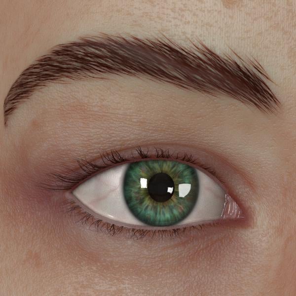
I'm rendering a 600x600 close-up of a female eye and the surrounding flesh with the same textures/shaders as we speak, so your wish for a zoomed-in view will soon be granted!
Hadn't even noticed her surroundings. Indeed this may have made the issue worse.
Really frankly, its hard to judge the skin texture because the expressions are pretty inhumanly terrifying, but with close inspection I was able to see what tripped me most, specifically its actually a very similar thing to something I said to gregorious, in trying to follow best practices you have focused on the microdetails of the skin texture and taken out the macrodetails (like baked in creases, shadows etc) but those details were simply removed rather than placed smewhere else. As a result you end up in a dip betwean the cheating way, that isn't accurate but has things that our brain recognizes as from a human, and fully accurate rendition of a human. Think of a drawing of some lips, you can either have an outline that symbolizes lips (baked in stuff and cheating) or a perfectly shaded image, but if you can only work in black and white with no shades of grey and you then go "but the lips don't have a sharp line around them" you might have a hard time trying to clearly convey the idea of lips.
Ignoring the skin, because its really hard to divorce from its context I will focus some on the eyes:
In addition to the mesh another thing that makes it hard to really judge what is going on beyond "that looks off" is that you are using hdrs, which can be distracting, in a more simple lighting setup its much easier to see exactly whats going on.
And as a general thing because i've seen comments from several people talking about wanting to just look at materials. IMO you cannot look at the skin material seperate from the mesh, because materials are often dependent on the mesh. A super simple example but to get good translucency on the ears, for instance, you can't just focus on the material settings. If the mesh is too thick the only way to get enough translucence on the ears is to raise the scattering distance (or its equivalent) to high and then the rest of your figure the SSS is too soft and starts passing through the thicker areas like that last image bluejaunte posted. And the more physically based your setup the more physically accurate your mesh generally needs to be.
Here's that close-up I promised!
Peter Fulford and Rashad Carter you two are hilarious! One can't help but improve with that level of scrutiny! LOL! Truth is, just about everything on the thread has a wax like look. It's incredibly difficult to elevate above the uncanny valley because the fact is the models are fake, the meshes are fake, and unless you are using photos for textures, the textures are fake too.
Rashad Carter and Gregorius there are many things correct with the way the skin interacts with the light, and I am truly impressed with the bump/displacement in Gregorius's close up. But the unnatural hair, eyebrows, expressions (lack of expressions) make it incredibly difficult to judge any type of "realism".
The way daz users approach realism is just problematic. We are being very technical and focusing on individual aspects of skin rather than the overall look. It's only a matter of time before someone post a render of Aiko and ask "doesn't it look realistic?"
I feel that unless Daz places a focus on realism, the users will never achieve it.
Thanks for the compliment on my bump mapping! Does this remark apply specifically to my work, Rashad's, or both? Unnatural how exactly? Can you put your proverbial finger on it?
Yay! Thank you so much! I love seeing your girl - she's so cute - even when she looks bad@zz like in that armour! lol :)
This is a great render! Their looks to be a little bit of lens distortion or something going on with her face on the right side - or is that just me? Like the hairline on the right looks like it's stretched up a bit? *shrug*
Other than that though, I love this!
I'll see about putting my girl in an environment and adding some DoF. :)
That shape is 100% better and more realistic than some of the first posts. The eyes are looking much better, perhaps a tad too white/bright (just IMO). But for the most part the eyes themselves look pretty decent, imo. The skin top-coat/texture (bumps/pores) look ok, I think, but the underlying color (the spots and freckles and stuff) look too "blurry". For some reason, they just don't look clear or in focus.