Store Redesign - Is this the new Daz store software?
 DMax
Posts: 637
DMax
Posts: 637
Does anybody know if DAZ has just cut over to the new store software? I just noticed for the first time something which is new to me... (see screenshot)... there seems to be icons of the product type (landscape, character, male/female, generation etc)... also, I noticed that the purchase confirmation emails have recently shown accurate numbers as opposed to previously.

Edited title to clarify that the thread is about the new store design
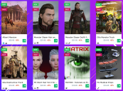
Screen Shot 2020-10-01 at 6.08.41 PM.png
2182 x 1616 - 4M
Post edited by Richard Haseltine on
Daz 3D is part of 
Connect
DAZ Productions, Inc.
7533 S Center View Ct #4664
West Jordan, UT 84084
Licensing Agreement | Terms of Service | Privacy Policy | EULA
© 2025 Daz Productions Inc. All Rights Reserved.
Comments
I'm into it.
Will say, one good thing about the old Daz store layout was i think they had perfected ratios between text and empty space. The hard borders around the store items, unobtrusive 'New' tags, etc., it was compact where it needed to be compact and spaced-out where it needed to be so you could differentiate between items. It was highly legible and low effort to scroll through.
I think the new layout needs a bit more work so that it is a bit easier to read because right now the spacing is off, just my 2 bitcoins.
This is not the new software just yet. This is just a step on the way to that software. Glad to see it is being received well.
I see it too.
I'm not 100% convinced by it. It feels a little as if all the individual items bleed into each other. I think I'd want something subtle to impose a bit more separation between products: more whitespace, or a faint divider line.
The Wishlist marker is also rather small, so wishlisted items don't really stand out.
I guess I'll get used to it, but it doesn't instantly feel like much of an improvement.
Wiskey Tango Foxtrot!
I really hope it improves! This is Not-So-Good...
----
But it's way better than the Googly-Eyed-Women of days past!
The design needs some tweaking, imo. It's a tad... IDK, what's the word to describe it? A little chaotic almost, I guess (again, just IMO).
Perhaps borders would help? IDK?
I like that it has information at a glance like the figure it's for, the type of content it is, etc.
I think a little tweaking on the design or colors would bring it up to the next level and help make it a bit less chaotic looking.
OMG I love it - Look at the little icons, they're so cute! When you hover over them they expand and show what the icons mean, awesome. I love that it gives you so much information just at a quick glance. The only things I'd like added are 1) bigger wishlist heart. Right now it runs the risk of not being noticed when scrolling through items and 2) when you hover over an icon like props or environments and it shows the word, it would be cool if you could click that and be taken to that category, it's not necessary because I can get there other ways, it'd just be cool. But even as it is, I love it. I've been really excited about the idea of a new storefront and I know this isnt it exactly, but it's a really nice preview :)
hopefully this will lead to better forums too with a truly fixed way to stay logged in!
Frankly, I like parts of it. The hot fushia for "New" stands out, and the little icons showing what it is (prop, environment, etc) is a good thing, not too overwhelming.
That said....
The wishlist icon TO ADD to the wishlist doesn't exist on the page I'm looking at or it's hidden really well. Where is it? (I went to "Shop" and went to the main page.) Is that a Daz Deals thing and maybe my settings are screwed up?
And yeah, that small yellow heart for the wishlist DOES NOT CUT IT. And agree, there's too much white!
And oh no, it appears the pictures (main ones) may be squished. The Gila Monster Truck is squashed on the New Debut page. Reminds me of that site that merged with Daz and we got all those horrific main promos.
The Product Library still needs a LOT of work.
(Inactive) products have no Readme info, so older items can still be downloaded but without any info.
I'm wondering if some kind of border around each product and the product info icons might help? Maybe something like this?
Or maybe giving the background a different color? So that each product is separated:
Right now with no borders and no separation between products and with everything white it all kind of meshes together visually, (again, just imo).
I agree.
yeah the new page visually look a little confuse with those too much "white space", now i'm hope which the new page come with more "search filters" like choose by type of stuff since now we have icons to display the "type" of product like if is a character, a outfit, a hair, props, tutorials then a 'search filter based on stuff type wouldd be really a great step in the right direction, another thing which i would love to see improved not on the store page but on the forum page is a really big improviment for search tools, to have filters for search for "users", thread titles and others filters, the forum really do need also a good improviment in search.
I find the new design much harder to read. Why do we need a sale flag when the %off is displayed? Previously the %off was bolder, so easier to read. I do not like the clutter of the extra little icons - just keepo it clean and simple - as it was!
The same icon for clothing and characters? No icon for poses or textures? It's all pretty ugly and lacks personality. Seems like a WIP. Whatever.
In my opinion, the 30% off discount on DOs for PC+ members should NOT be accompanied by a SALE flag, because if so, EVERY DO will look like it's on SALE, rendering the SALE flag on DOs of no consequence or practical convenience.
about the "same icon" i feel which is more like they not added "all the icons" because some outfits does have they own "cloth icon" while others have only the "female/male icon, which means we have the icon for cloth but it not was added to all the products yet
also about the poses it's seens which they have icon too but a lot of product are still missing they "proper icons" many products only have the "generic male or female icon, they are missing they unique icon
it's looks like is more a case of "icons not being applied" than they "don't exist" it's just the icons are not proper being applied to all the products, you do have all the icons they are just not being applied to all products properly.
Could we get different icon colors for "Add to cart" and "Purchased", please? They're both small green squares with white icons in the square, which makes them spectacularly hard to tell apart at a glance.
My first impression on seeing the store was that I must be on another web site. But I'd get used to it. Then I noticed some items for over $100, even around $200. I wondered if DAZ was going to be too expensive for me.
Agree that a border around each product would help -- we're used to having the name and such at the bottom of each product, but I remember how spectacularly confusing it was when the daily emails showed up differently in different email programs, with some displaying the name above the thumbnail. A border would help with that as well.
As for the icons for product type, yay for more info, although I detest icons, but I imagine I'm in the minority and words would take up more space. Please let there be corresponding filter options, and please give some thought to how to deal with textures for clothing -- currently the actual clothing is tagged with the figure it's for, but textures are not, so filtering by figure doesn't apply to them.
Some other icon and/or filtering options I would find extremely useful:
1) the current (or has it been removed?) dForce filter box under Software doesn't seem to work (unchecking it doesn't filter out dForce items). It would also be useful to be able to tell at a glance whether an item was dForce only or could be used as a conventional conforming item.
2) Material/shader filters -- It would be useful to know whether an item has Iray, 3DL, or both, and with the new bridges and native formats for other software, whether it has native shaders as well.
The setup is more than a little "tight". Whitespace isn't used just because it looks nice...lol...it's used because it makes things easier to see/read.
Laurie
I love the icons! Not sure about the rest of the look, but it'll probably grow on me.
This. The icons would work with the last design the new one has way too much whitespace and looks cheap
Well, it's... "interesting".
Edit: I just found pout about the ability to hover over the icons for tip text, and I found out what the mystery whatsit is; "Models". What does that mean? I see it applied to a couple of pose sets, but not most of them. And what is the "Shaders" icon supposed to be? And the prongs on the "Plugins" plug are as close to invisible as makes no difference.
It's a little bit of a shock, probably won't seem so drastic after a few days of looking at it, but I'm not hating it. I don't like proposed framing, makes it look like... that other place. However, subtle drop shadow could go a long way to divide the items, as well as toning down the white by a notch so it's not so screaming out for those with sensitive eyes (I myself am a fan of light layouts). Having a dark layout option as an alternative seems to also be popular with websites these days.
^This - having the background a different colour looks good - without it, it looks...cheap (for want of a better word).
On the plus side - more info from the icons is a good move.
My suggestions:
1. Use a higher weight or bold font for the normal and sales price information.
2, Now that there are icons for props, hair, environments, lighting, etc., please provide filters for those categories. Typing N/A brings up everything but DAZ compatible figures, which is often too many items to look through when I'm looking for something specific like props or tutorials.
This. I have to look. at. every. single. icon. to. know. whether. or. not. I. bought. it.
It makes my eyes scream in pain
The 'plugin' icon? You mean the little black heart under the left edge of the product picture. On my 1920 X 1080 laptop there are NO prongs - and after three forced reloads there are still no 'tips' text showing up when I hover the mouse over them. Also, I always seem to get at least one item that fails to align correctly - note the luggage image here.